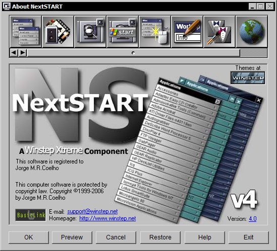
NextSTART 9.5
Component of
Winstep Xtreme
NextSTART License and Warranty
The NextSTART program and all included documentation are all Copyright 1999-2009 by Jorge M.R.Coelho - Winstep Software Technologies. All Rights Reserved.
THIS SOFTWARE IS DISTRIBUTED "AS IS," WITHOUT WARRANTY AS TO PERFORMANCE OR MERCHANTABILITY OR ANY OTHER WARRANTIES WHETHER EXPRESSED OR IMPLIED. BECAUSE OF THE VARIOUS HARDWARE AND SOFTWARE ENVIRONMENTS INTO WHICH THIS PROGRAM MAY BE PUT, NO WARRANTY OF FITNESS FOR A PARTICULAR PURPOSE IS OFFERED. GOOD DATA PROCESSING PROCEDURE DICTATES THAT ANY PROGRAM BE THOROUGHLY TESTED WITH NON-CRITICAL DATA BEFORE RELYING ON IT. THE USER MUST ASSUME THE ENTIRE RISK OF USING THE PROGRAM.
You can contact us with comments or questions by e-mail at support@winstep.net
NextSTART is a component of the Winstep Xtreme suite of applications. You may try Winstep Xtreme and all its components for 30 days without charge. If you find NextSTART or other Winstep Xtreme components useful, please register. If you decide not to register Winstep Xtreme, you must remove it from your system after the 30 day trial period.
You are not allowed to reverse engineer or change the contents of the program files or included documentation.
NextSTART may not be sold nor be used in any profit-oriented endeavor without the express written permission of the author, with the exception that the Winstep Xtreme suite, from which NextSTART is a component of, may be distributed freely via media intended to make shareware available to the public for trial, such as magazine cover cds or the web. All files, including the NextSTART program and all others in the Winstep Xtreme zip file, must be included.
All trademarks used in this Document are the property of their respective owners and are used for explanatory purposes only.
Winstep Xtreme is a suite of groundbreaking components for the Windows environment.
The purpose of this suite is to provide usability enhancements to the standard Explorer Shell while at the same time providing the user with unlimited flexibility.
NextSTART, a powerful Start Menu and Taskbar replacement, Workshelf, NeXuS, Start Menu Organizer Pro and Font Browser are all components of Winstep Xtreme, with more components forthcoming.
NextSTART is a powerful, dynamic pop-up menu that can be used as a replacement or supplement to the Windows Start Menu and Taskbar. NextSTART also offers an incredible amount of flexibility so that the user can customize it to his needs and wishes. What follows is just a brief description of its many useful features...
Powerful Menu System
Unlike many other menu programs, NextSTART does NOT require you to re-enter the paths to all the programs listed on your Start Menu. NextSTART will automatically read the directory structure of your Programs folder(s) and create a menu for you on the fly! In fact, thanks to NextSTART's dynamic menu support, it will create as many menus as you wish based on any hard drive or directory! If you wish to create your own customized menu system, no problem! NextSTART includes a powerful, built-in Menu Editor allowing you to create any number of menus. The Menu Editor also allows the use of over 80 handy Internal Commands that give quick access to not only NS specific features but also many popular Windows functions.
Complete Start Menu And Taskbar Replacement
NextSTART features built-in task management to control running apps and the Windows System Tray. Gain access to your running apps via handy task icons/tiles right on your desktop. Best of all, you can choose the position of the "task list", the style, and even which icons should be displayed for specific applications. NS also allows you to place the Systray and task list anywhere on your desktop!
Advanced NeXT-Style Look And Feel
The NextSTART user interface was heavily inspired by the original NeXTSTEP operating system. Unlike many other Windows shell replacements and add-ons, the association is more than just skin deep. We've adopted many NeXT style functions and controls both in the menus and in the new and improved NS2 Preferences Manager. NeXTSTEP/OPENSTEP users should feel right at home. We've also expanded on these "classic" ideas and added plenty of our own, creating an advanced and unique menu system for Windows Users.
Customizable Menus and Theme Support
Not happy with the default NextSTART configuration? Would you prefer a menu system that emulated OS/2 or Mac? How about transparent menus? No problem...You can configure how the menus look and behave! Choose where scroll-buttons are located, how menu selection is made, which mouse button activates the menus, assign hot keys and more! You can choose the font, the size, the colors (even use gradients and bitmaps!), 3D effects, custom icons and, still, more! In fact, thanks to the improved Theme support of the NextSTART Preferences Manager you can now import and export themes based on the above options. Share them with your friends!
Hotspot Support
Thanks to an incredibly flexible feature utilizing user defined Hotspots, you can "attach" a menu to not only different areas of your desktop but also other menu programs and applications! Hotspots can also be used to run applications or NextSTART internal commands with a single mouse click!
Theme Integration with other Winstep Applications
If you run other Winstep applications, NextSTART integrates smoothly with them. For instance, WorkShelf's context menus will use the current NextSTART theme if NextSTART is installed and running. Also, loading a theme in NextSTART will automatically apply a matching theme to WorkShelf (and vice-versa), if one exists.
NextSTART is a component of the Winstep Xtreme suite of applications. Winstep Xtreme is SHAREWARE. You may try it for a period of 30 days, after which you must either purchase it or remove it from your system.
Your purchase of Winstep Xtreme entitles you to one year of free updates for all components of the suite - including any new components that might be released in the mean time - with one year renewals costing only a fraction of the purchase price. Anything you download and install while your subscription is valid will be yours to keep - for life!
If you find this component useful please support the shareware concept and it's authors. Registration encourages future development. Thank You.
Click here to REGISTER ON-LINE WITH CREDIT CARD or DOWNLOAD THE ORDER FORM FOR CHECK/MO
System Requirements:
Windows9x/ME, Windows NT v4.0 (w/Service Pack 3 or higher), Windows 2000, 2003 Server, XP 32/64 bit, Vista 32/64 bit or Windows 7 32/64 bit.
Running NextSTART for the first time
Right after starting for the first time,
NextSTART might give you a warning about Active Desktop being enabled on your
computer. Active Desktop is only used by Windows to display web pages and JPG wallpapers
on the desktop. The problem is that when Active Desktop is enabled it will
usually interfere with most Windows customization programs such as NextSTART! Active Desktop can cause a variety of conflicts, from desktop icons
re-appearing after having been hidden to constant fighting over the control of the Windows taskbar. It is
therefore highly recommended that you allow NextSTART to disable Active Desktop
(this might require a reboot).
Active Desktop can later be turned back on, if required, by clicking on the 'Enable Active Desktop' button in the Global Preferences tab of NextSTART. If you decide to ignore the warning and leave Active Desktop enabled, you can prevent this warning from being issued every time NextSTART runs by selecting the 'Disable Active Desktop Warning' option also in the Global Preferences tab.
Introduction to the Menu system in NextSTART
Menus provide a list of commands that can be executed. You are probably more than familiar with the menu system used by Windows. NextSTART, however, introduces you to a completely flexible menu system where just about anything can be configured. All the menus used in the remaining components of the WinStep Xtreme suite assume the look and feel you specify under NextSTART.
Generally Menus have the following layout:
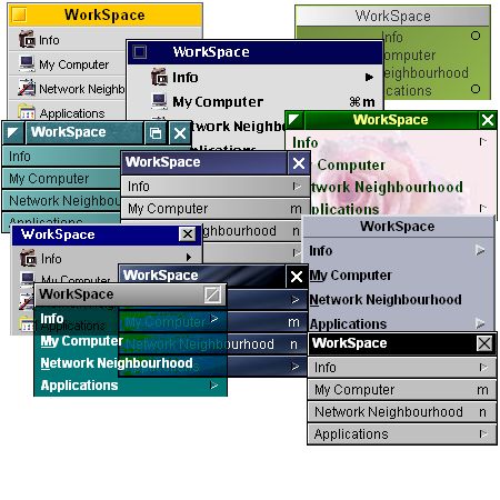
Titlebar: The titlebar holds the name of the menu. You can use it to move and close the menu and to access the preferences window.
Titlebar buttons: There are four types of titlebar buttons, which enable you to execute specific actions: Close the menu, Rotate it from vertical to horizontal and vice-versa, Roll it up or down or make it Always On Top.
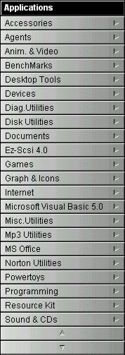
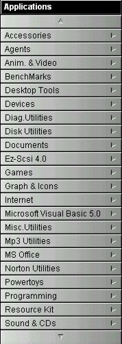
Menu area: The menu area holds the actual contents of the menu. If there is an arrow to the right of an item this means that clicking on that item will open a sub-menu, otherwise the item is a 'command item'. If there is a letter instead, then pressing CTRL together with that letter key on the keyboard will execute this item.
If the menu is empty - i.e.; it has no items - then a single button with the word '(Empty)' will be displayed.
Selection Bar: The selection bar allows you to know which item is currently selected. If you prefer you can have no selection bar at all or have the selection bar automatically follow the mouse pointer as it navigates the menu.
Separators: A separator (or spacer) provides a way to separate individual sections in the menu area. Separator items can be added to a menu in the Menu Editor, but note that they will only show up if the current theme supports them (some themes would look bad with standard separators).
Scroll Buttons: If a menu is too big to fit on screen, then two special buttons will be appended to it. These two buttons allow you to scroll the visible contents of the menu up or down.
Endcap: An endcap is normally used so that a menu does not look 'incomplete'; i.e.., if you are using a titlebar with rounded corners, an endcap provides a way to 'finish' the menu with rounded corners as well, instead of with a rectangular section. You can also use an endcap as you would a titlebar, i.e.; to move the menu, close it, access NextSTART Preferences, etc...
To move a menu simply click on the titlebar or endcap and drag. Note, however, that moving the main menu will automatically update its relative position to the owner window in the hotspot list, unless they are set to 'snap to mouse'. What this means is that the next time you click on that hot spot the menu will appear at the last position you dragged it to. Sub-menus, however, will not remember new positions.
If you try to drag a menu that has an open sub-menu tree then NextSTART will first close all the open sub-menus.
If you drag a sub-menu, however, this turns into a special menu independent from the parent menu. It will stay on screen until you deliberately decide to close it.
To close a menu and any open sub-menus after it, right-click on the menu’s titlebar/endcap or on the close button in the titlebar (if one is available). If you have the selection bar enabled then you can also press the ESC key.
To keep a menu on screen and close only any open sub-menus, left-click on the menu’s titlebar.
To close all menus, click anywhere on the desktop or on another window. Note that this will only work if you have selected the Close Menus Automatically option in the hotspots tab of the preferences window, otherwise you will have to right-click on the titlebar of the parent menu.
Rolling up a menu is very useful so that only the titlebar of that menu is displayed, thus preventing 'sticky' menus from using too much screen real estate until absolutely necessary. Menus can even be made to automatically roll up or down as the mouse pointer moves into or away from the menu (see Hotspot Preferences).
In the absence of a roll up button on the menu's titlebar, menus can be rolled up and down by left clicking the menu's titlebar/endcap while pressing the CTRL key.
Horizontal menus take very little vertical screen space and are ideal for always-open menus, especially when placed at the top or bottom of the screen. To make a menu be always-open and horizontal, you will need to associate the menu to an hotspot on the hotspots tab of the preferences window, enable the 'Auto Run' and 'Horizontal Menu' options, and give the hotspot a unique 'Group' name. Note that not all skinners make provisions for horizontal menus, therefore these might look a bit odd with certain themes.
In the absence of a rotate button on the menu's titlebar, menus can be toggled between vertical and horizontal by left clicking the menu's titlebar/endcap while pressing the SHIFT key.
A always on top menu will always be above normal windows, even when these are made active
In the absence of a 'Z-Order' button on the menu's titlebar, menus can be toggled between always on top and normal z-order by left clicking the menu's titlebar/endcap while pressing the ALT key.
To navigate a menu you can use either the mouse pointer or - if you have the selection bar enabled - the keyboard.
When using the mouse to navigate, simply click on the item you want selected. If that item leads to a sub-menu (denoted by an arrow at the right) then a new menu will appear next to it, otherwise the associated command is executed.
Mousing over a document or video item will automatically display a thumbnail of that item next to the menu after a short delay.
It’s always a good idea to have the menu selection bar enabled as this will also allow you to navigate the menu using nothing but the keyboard if you want. You can then use the up and down arrow keys to change the currently selected item or you can press a letter key and the selection bar will cycle through all the items whose name starts with that letter. When using the arrow keys and the beginning or end of a menu is reached, the selection bar will simply wrap-around. If the menu is too big to fit on screen, it will automatically scroll to show the currently selected item.
To jump directly to the beginning or end of a menu, use the Home and End keys.
You can use the left and right arrow keys to jump between sub-menus and parent menus: Pressing the right arrow key or the enter key on an item that leads to a sub-menu will open that menu. Pressing the enter key over a command item will execute that command. Pressing the left arrow key will close the current sub-menu and pass control to it’s parent menu.
Pressing ESC will close the current menu.
To execute a command item with the mouse, simply click on the item that you want to execute. You can also execute command items using the keyboard, in one of two ways:
If the theme enables Hot keys, then the command item might have a letter displayed at the right. If that is the case, then you can press the CTRL key together with this letter to execute the command.
If the selection bar is enabled, then you can also navigate the menu as explained in the previous section and execute the command by pressing the enter key. If you hold the CTRL key while pressing enter, the menu will not close automatically.
To open a sub-menu item as a folder in Explorer instead of as a NextSTART sub-menu, simply triple click on that item. There is no keyboard equivalent.
When the menu is too big to fit vertically on the screen, it will display two scroll buttons. These scroll buttons can be located either both at the bottom or one at the top and the other at the bottom (classic Windows style):
....
It can be argued that having both scroll buttons at the bottom has more advantages, since you don't have to move the mouse so much when scrolling up and down. In the end it's all a question of style and personal choice.
If the Automatic Scrolling option in the Menu Preferences tab is enabled, then there isn't even any need to click on a scroll button: just move the mouse pointer over it and the menu will start to scroll automatically. NextSTART is also mouse-wheel aware, so you can use your mouse-wheel to scroll a menu if your mouse provides this feature.
Since NextSTART can hold anything up to 9,999 items in a single menu, theoretically the limit will not be reached. However, If you wish to reduce the length of your menu on screen, you may change this value to something more reasonable (30, for example) and then a 'More' button will appear at the bottom of the menu. Clicking on the 'More' button will bring up the rest of the menu adjacent to the first. If you were to have, say, over 70 items in a menu, then the next menu will also show 'More' and so forth.
To quickly access the 'More' button, press the END key on the keyboard. This will make the selection bar jump to the end of the menu.
Normally when you close a menu, all child sub-menus close as well. If you want a sub-menu to remain open even after closing the parent menus, grab the sub-menu by the titlebar or endcap and drag it away from the parent menu. The menu then becomes 'detached' from the parent, and therefore independent from it. It will stay on screen until you deliberately decide to close it.
The following holds some examples of what can be accomplished with NextSTART.
Using Drag and Drop to manipulate Menus
Drag and Drop can be used to move/copy items from one menu to another, re-arrange them and even move/copy files from a menu to an Explorer window and vice-versa. Drag and drop can also be used to move items between NextSTART and WorkShelf. However, due to the diversity of NextSTART menus, you should grasp a couple of concepts first:
There are basically two different types of menus in NextSTART. Regular menus can hold any type of item and are created using the built in Menu Editor. Folder menus, on the other hand, are virtual menus that display the contents of physical or virtual folders on your hard drive. This difference is fundamental in the way drag and drop works for each type of menu.
To move an item from a menu to another target, you must press the SHIFT key, click on the item and drag. To copy an item from a menu, you must press the CTRL key instead. Dragging an item over a rolled up menu's titlebar makes the menu automatically un-roll. Dragging an item over a sub-menu item makes that sub-menu automatically open after a couple of seconds.
Adding files in Explorer windows to menus
To drag a file in an Explorer window into a NextSTART menu, simply click on the file and drag it to the menu you want.
If the target menu is a Regular menu, you can choose the insertion point and NextSTART will insert a Run Program type of item - if dragging a file - or a Show Folder type of item - if dragging a folder.
If the target menu is a Folder type of menu, then dragging a file or folder will actually copy or move it into the folder whose contents are being displayed by that menu. Since the sorting method for Folder menus is pre-set in the Preferences screen, in this case it doesn't matter if you choose a specific insertion point or not. The menu will re-arrange itself according to the sorting method.
Copying or moving files from menus to Explorer windows
To move a file in a Folder menu into an Explorer window, press SHIFT and drag it into the target. To copy a file press CTRL instead. Note that you can only copy actual file system objects (virtual or physical) from Regular menus into Explorer windows.
Copying or Moving items from a menu to another menu
To copy or move an item from a menu to another menu, open both the source and target menus and drag the item you want using SHIFT (to move) or CTRL (to copy).
You can re-arrange the order of Regular menu items by pressing SHIFT and dragging the item up or down until it is in the position you want. If you press CTRL, the item will be copied instead of moved ( an easy way to duplicate menu items should you ever wish to do so ). Items in Folder menus cannot be re-arranged because their sort order has been pre-set in the Preferences screen.
A context-sensitive menu is a menu with options related to an highlighted object or menu item. Each item in a Regular or Folder menu has a context menu, accessible by right-clicking on the item. Options available in contexts menu of file system items are basically the same provided by Explorer for that item type. The available options also depend on whether the menu is a Folder or a Regular menu - a few basic functions are explained below:
The Insert option allows the user to insert a new menu item into a Regular menu or to copy a file or folder into the physical folder whose contents are displayed by a Folder menu. For Regular menus, a dialog window opens ( similar to the right side panel of the Menu Editor ) in which you can define what type of item you want to insert into that particular menu position. On Folder menus, the File Browser opens instead, allowing you to select a file or folder to be copied into the physical folder displayed by that Folder menu.
The Open option executes the item related to the context menu. It is the same as left clicking on that item.
The Delete option deletes the item associated to that context menu, after asking for confirmation. If the menu item belongs to a Folder menu, the actual physical file or folder associated to that menu item is deleted ( or sent to the recycle bin, unless you have 'Remove files immediately when deleted' selected in the Recycle Bin options, in which case the file or folder is permanently deleted ).
The Rename option allows you to rename the label of the associated menu item. If you rename an item in a Folder menu, the actual physical file or folder associated to that item is renamed as well.
The Properties option, when applied to an item in a Regular menu, brings up a window dialog that allows you to view and change that item's properties like if you were on the actual Menu Editor. When applied to an item in a Folder menu, it brings up the normal Windows Properties dialog for the associated file.
On Regular menus, some items can point to folders and be of type Run Program. This means that that particular folder will open in an Explorer window when clicked on instead of opening as a sub-menu that displays the contents of that folder. On such items, you can use the Browse with NextSTART context menu action to show the contents of that folder as a sub-menu.
When you right click on a folder item in a menu, you also get a 'Create Shelf from Folder' option in the context menu that pops up. This option can be quite handy to quickly add a new Folder type shelf to WorkShelf displaying the contents of that specific folder. Note that WorkShelf must be running for this option to work.
NextSTART can replace the standard Windows taskbar with its own - much more powerful, flexible and skinnable - version.
The default NextSTART startbar mimics the regular Windows taskbar but, unlike it, the NextSTART startbar is divided into several individual sections, each perfectly independent from the others. The NextSTART startbar acts as a 'container' to these sections, which are: Start Button, Quick Launch area, Tasklist area, System Tray area, Workshelf's desktop modules area and the startbar collapse handle. Each section in the NextSTART startbar can be set to appear on the startbar or not. The order of each section within the startbar can also be set by the user.
The startbar itself can be docked to any screen edge or made to float anywhere on the desktop. It can also be resized by dragging any of it's edges.
Start Button
The Start Button displays the main NextSTART menu by default. It can, however, be configured to activate any of the other 72 possible hotspots. Since hotspots are not necessarily associated to menus, the Start Button can therefore be alternatively used to launch applications or run internal NextSTART commands.
Quick Launch Buttons
The Quick Launch area holds shortcuts to NextSTART Quick Launch-type hotspots. Because of this, and unlike the Windows Quick Launch area which can only be used to run applications, NextSTART Quick Launch items can also be used to display menus, run internal NextSTART commands, etc... When NextSTART runs for the first time, it automatically fills its Quick Launch area with the application shortcuts that exist in the original Windows Quick Launch area.
It is important to understand that the NextSTART Quick Launch area is NOT the same as the Windows Quick Launch area: one holds hotspots, the other shortcuts to frequently used applications. Changes made to the NextSTART Quick Launch area are not reflected in the Windows Quick Launch area, but, for convenience sake, NextSTART scans the Windows Quick Launch folder every time it starts and automatically adds any missing items to the NextSTART Quick Launch area (i.e. missing items are assumed to be new Quick Launch shortcuts, added by Windows since NextSTART last run). This behavior can be disabled by unselecting the 'Retrieve from Windows' option in the Quick Launch section of the Startbar Preferences tab, in which case the NextSTART Quick Launch area is only affected by user-made changes.
Shortcuts can be easily added to the NextSTART Quick Launch area by using drag & drop or by clicking on an empty space of the Startbar and selecting 'New Quick Launch Item' from the context menu. To delete unwanted Quick Launch items, simply right click on the relevant item and select 'Delete' from the context menu. Quick Launch items can also be re-ordered at will using drag & drop: simply click on the item you want to move and drag it onto a new location within the Quick Launch area.
Quick Launch icons can be quickly customized by dropping an *.ico or *.png file into the button, and the size of the icons can also be set independently from that of the tasklist icons. You can also right-click on a Quick Launch item to get at it's Properties dialog.
Tasklist
The tasklist holds buttons representing all currently running programs. The tasklist section is special because it does not have to be necessarily attached to the startbar, it can be placed individually anywhere else on the desktop. In fact, should you so wish, you can dismiss the 'container' startbar entirely and have nothing on your desktop but the tasklist and the system tray. Each task in the tasklist is represented by a button with the icon of the running program, and, optionally and if the theme allows it, a label displaying the title of the associated window. In addition, if you move the mouse pointer over the tile, a tooltip instantly pops up with the title of the associated window. Under Windows XP and above, you also get a thumbnail of the associated window to help you differentiate between similar documents.
Mouse click actions on tasklist tiles can be set independently by the user. By default, left clicking on a tasklist tile will bring the associated window into the foreground (automatically un-minimizing it if necessary) or minimize it if it is already in the foreground, middle clicking will close the window and right clicking will pop up the associated task's context menu. Other actions you can associate to each of the different mouse clicks are: Minimize, Bring to Front, Close, Front/Minimize, Tasks Menu, Minimize Similar, Close Similar and Restore Similar.
Pressing SHIFT-CTRL when you click on a task tile will apply that action to all instances of the same task (for instance, SHIFT-CTRL-middle click on an Explorer window will close all currently open windows of Internet Explorer, while SHIFT-CTRL-left click would un-minimize all the windows instead). If you are using a two button mouse, you can emulate a middle click by holding the ALT key while you left click on a task tile.
The following is a list of all the task mouse and keyboard combinations and their default actions:
| Left Click | Brings a window to the front or restores it if it is currently minimized. |
| Middle Click or ALT+ Left Click | Terminates (closes) a window. |
| Right Click | Pops up the Task's context menu (see below). |
| CTRL + Right Click | Pops up the Task's context menu (see below). |
| CTRL + SHIFT + Left Click | Restores all similar applications (e.g. restores all Internet Explorer windows). |
| CTRL + SHIFT + Middle Click | Closes all similar applications (e.g. terminates all currently running instances of Internet Explorer). |
| CTRL + SHIFT + Right Click | Minimizes all similar applications (e.g. minimizes all Internet Explorer windows). |
| Left Click and Drag | Allows you to re-order task buttons. |
| CTRL+ Left Click on icon and Drag | Allows you to initiate a drag & drop operation with the executable associated to that task. |
Ctrl-Right clicking a task opens that task's context menu, from there you can perform all of the above actions as well as Minimize and Restore all currently open applications, move and re-size windows, set the opacity of the associated window (Windows 2000 and above only), change the default icon of a task and add or remove tasks from the Snapshot Exclusion list. From this context menu you can also control several tasklist settings, such as tasklist icon size, style, task grouping, etc...
If you 'drag over' a document or file onto a tasklist tile, this will restore/bring onto the foreground the window/application associated to that tasklist tile. This function is very useful when you want to drag and drop an object into a window that is currently minimized or obscured by other windows.
Under Windows XP and above, the tasklist is also able to display 'thumbnails' or 'previews' of the associated windows, which is a great visual queue when you have lots of similar applications or documents open at the same time, all displaying the same icon. Under Vista and above, window thumbnails are 'live'.
Each window thumbnail also displays the title of the associated window, which is very useful if you have configured the tasklist buttons not to display labels. Furthermore, when you have the taskbar set to group similar tasks, mousing over a grouped task button shows the thumbnails of all the windows in that group side by side.
The task window thumbnails are also interactive, in that you can click on them to perform all the actions you would using the actual task button. Mouse over a window thumbnail and after a short delay all top level windows fade out to reveal only that window. This works even if the window associated to that thumbnail is currently minimized.
You can quickly specify the icon used to represent a specific application by dropping an *.ico or *.png file into the task tile, or by going into the Task Customization dialog which you can find in the Tasklist and Systray panel of NextSTART Preferences. In this dialog you can also prevent specific tasks from appearing in the tasklist, or specify applications that have problems with the snapshot function. Note that the size of tasklist icons can be user-specified: the tasklist can use 16x16, 32x32 or 48x48 pixel icons.
New tasks are added by default to the end of the tasklist but you can also have NextSTART sort the tasklist by similar tasks (e.g.; tasklist buttons for documents opened by the same program are always displayed together in the same area of the tasklist) or group similar tasks into a single button. The latest option allows you to create more available space on the tasklist, which can be important if you have many windows open at the same time - for instance, if you have four Notepad windows open, the four notepad tasklist buttons will be grouped into a single task button named 'Notepad'. Clicking on this button will make a menu pop up with the names of the four different notepad windows. The button holding grouped tasks also displays the number of tasks grouped into that button (e.g.; using the latest example, '4*' would be displayed next to the 'Notepad' description).
You can re-order task buttons at will by left clicking and dragging the task button to the position you want within the tasklist.
If there are more task buttons then those that will fit in the available space, the tasklist will automatically display scroll buttons.
As stated previously, the tasklist does not need to be contained in the startbar. When floating independently on the screen, it can be moved around simply by left clicking and dragging it to the new position (note that to reorganize task buttons on a floating tasklist you should press CTRL while left clicking). You can then lock it in place, so it isn't accidentally moved, by selecting the 'Lock Tasklist' option in the Tasklist and Systray Preferences tab. A 'floating' tasklist can also be made to use any portion and size of your desktop, and, like the startbar, it can be placed anywhere on the screen as a vertical or horizontal strip.
WorkShelf Desktop Modules Area
If you are running WorkShelf, the NextSTART startbar can capture Workshelf's desktop modules so they are neatly contained within the startbar itself. The startbar will automatically grow to accommodate the largest module.
WorkShelf desktop modules can be captured into the startbar as icons (the default, in which modules assume the aspect of WorkShelf's in-shelf modules) or exactly as they look on the desktop. The later can prove troublesome if you change themes frequently, since different themes have differently sized desktop modules and some could make your startbar grow to huge sizes in order to accommodate them.
You can choose which WorkShelf desktop modules attach to the startbar - and specify other related settings such as icon size, etc... - by clicking on the 'WorkShelf' button in the Startbar tab of NextSTART Preferences. Alternatively, you can also use the 'Attach to NextSTART' and 'Detach from NextSTART' commands in the context menu of the WorkShelf desktop modules.
System Tray
The systray, also known as the Windows notification area, provides a location for programs and hardware devices to display icons. The NextSTART systray can be contained by the Startbar or left floating independently anywhere else on the desktop.
NextSTART adds a couple of visual effects to the systray, where the background can be rendered transparent and the icons feature a drop down shadow. If the NextSTART systray button is enabled (which it is by default), the systray can be toggled on and off view by clicking on it. The systray button can also display the current time and will open the Windows Date and Time panel when double clicked.
Startbar Collapse Handle
Like the regular Windows taskbar, the NextSTART taskbar can be made to auto-hide. It can automatically hide into a screen edge or it can be made to hide and pop up manually by clicking on the startbar collapse handle (when hidden this way, only the small handle is then visible).
NextSTART is fully multi-monitor compatible. Menus can be made to pop up on any of the available monitors, hotspot buttons, the taskbar and the systray can also be positioned on a specific monitor and the NextSTART startbar can be made to span all the available monitors.
As previously mentioned, NextSTART relies on different ‘hotspots’ to show up to 72 independent menus or perform up to 72 actions. So what are hotspots?
Hotspots are areas on the desktop OR any other window that can be clicked on with the left, middle or right mouse buttons. Hotpots can also be screen edges and corners. Each hotspot can be associated to one of several actions:
1 - Show a menu displaying the
contents of a folder.
2 - Show a pre-defined menu built with NextSTART's Menu Editor.
3 - Show a menu displaying all the currently
running tasks.
4 - Launch a program.
5 - Run one of the over 80 NextSTART internal commands.
6 - Load and apply a specific NextSTART theme.
7 - Show a menu displaying all the available NextSTART themes.
8 - Show a menu displaying the contents of one of the following special shell folders:
Control Panel
Desktop
Favorites
Fonts
History
My Computer
My Documents
Network Neighborhood
Printers
Programs
Quick Launch
RAS Connections
Recent Documents
Recycle Bin
Templates
9 - Show a special menu that enables you to control the popular WinAmp MP3 player application.
Menus based on folder contents are self-explanatory: NextSTART reads the contents of the folder you specify and displays that as a menu structure. Entire disk drives can be navigated this way. Usually these type of menus are used to display the contents of your Programs folder, Favorites folder, etc... Due to the nature of the Start Menu in an NT system, it's even possible to specify two directories for this type of menus: NextSTART will merge the two folders into a single menu, just like Windows 2000 and XP currently do. This way, you can have a single menu displaying the contents of the programs folders for the Administrator and All Users in a NT system.
Pre-defined menus are extremely powerful: using the built in Menu Editor, or even drag & drop, you can construct virtually any menu structure you like. A good example is the default menu provided in NextSTART. Each item in a pre-defined menu can be one of the above items. Pre-defined Menus can also be chained together, creating complex menu structures if so required.
A task list menu is an alternative to the built in NextSTART Taskbar replacement. This menu holds a list of the currently running tasks and is automatically refreshed every second.
Hotspots can also be used to launch programs or run internal NextSTART commands instead of menus. Internal commands are items that do specific actions and can be added to menus built with the Menu Editor.
Let’s give you a practical example:
Suppose you want NextSTART to display a menu when you click on an 8x8-pixel square at the upper left corner of the desktop. To accomplish this, follow these steps:
That’s it. Press OK and left click on the top left corner of the desktop. A menu containing your most recently used documents - just like the ‘Documents’ sub-menu of the Windows Start Menu – should pop up right next to your newly created hotspot.
Remember that hotspot 0 takes precedence over hotspot 1 and so on, that is, if hotspot 0 is covering the whole desktop area and you make a new hotspot inside this same area, hotspot 1 will not work. If, however, hotspot 1 is the one using the whole desktop area and hotspot 0 the section within this area, then hotspot 1 will work except in the area covered by hotspot 0.
Once you have NextSTART configured exactly the way you want it, the next thing you might wish to do is to save these settings for later use in the event of a system crash, user error, etc. Luckily, NextSTART features two handy Internal Commands for just such a
purpose, which you can find in the settings sub-menu. You can also find two
buttons that will do the same thing in the Global tab of NextSTART Preferences.
"Backup NS Settings" will take a snap-shot of all current settings (menu structure, hotspots, current theme, and so forth). When this Internal Command is activated it will open a File Browser window and allow you to save the backup to a file named nsbackup.nbk (or another of your choice).
"Restore NS Settings" works fairly similar to the above but performs a reverse function. After the user chooses the backup file in the File Browser window it will restore all the NextSTART settings you had previously saved.
Aside from the practical and rather mundane purpose of backing up/restoring settings, the more adventurous user can also use these commands to store and load different backup files for different needs.
For example, if you happen to be a user who likes to emulate other operating systems you could create different 'backup' files for each OS configuration (NeXT.nbk, BeOS.nbk, Whistler.nbk, etc...) and load them when the mood strikes.
When NextSTART runs for the first time, it
automatically creates a backup file with the default settings in
the ...\Winstep folder. The nsDefault.nbk file can therefore be used to restore
settings back to the default state should you later run into trouble while
experimenting with NextSTART.
NOTE: you should make sure that any theme you used at the time of the backup is installed prior to attempting a restore.
The NextSTART Preferences window is the Graphical User Interface to all of NextSTART settings.
The Preferences window can be invoked in many ways: by double clicking on a menu’s titlebar/endcap, by double clicking on NextSTART’s tray icon, by right clicking on this icon and selecting Preferences or with the keyboard by pressing CTRL-F12. This latest key-combination can be changed, if necessary, in the Global tab of the Preferences window itself. If you manage to get yourself into a corner by disabling all these access options, there is still one more way to access the preferences window in an emergency: by running NextSTART with the 'setup' command line argument ( e.g.; 'c:\program files\WinSTEP\Nextstart3.exe setup' ) .
The Preferences window Command Buttons
The row of buttons at the bottom of the preferences window perform the following actions: The OK button applies and saves any changes you made and closes the preferences window. The Preview button allows you to preview changes to the look/feel of the menus without saving. The Cancel button reverts all changes made and also closes the preferences window. The Restore button reverts all changes made but remains on the preferences window. The Help button summons up this help file. Finally, the Exit button exits NextSTART - a confirmation will be requested.
Note that what happens when you press the Help button depends on you having Microsoft Internet Explorer installed or not. If IE is installed, NextSTART will display the HTML help file with its internal browser. If IE is not installed, then NextSTART will try to launch the default browser for that system, and report an error if it does not succeed.
The Menu tab allows you to configure how your menus behave.
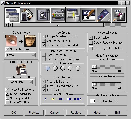
If Show Thumbnails is enabled, moving the mouse pointer over a video or image item in a menu will automatically display a thumbnail of that item next to the menu after a short delay. The context menus of video and image items also display the same thumbnail. The size of the thumbnail can be specified in the pull up menu below (ranging from very small to very large).
Folder-type menus are menus that display the contents of folders on your hard drive. You can specify if file extensions, plus hidden and system files should be displayed on Folder-type menus or not. If Show File Extensions is checked, then all files whose extension is not .LNK, .URL, .PIF and .CPL will have their file types displayed next to the filename. Checking Show Hidden Files and Show System Files will make NextSTART display hidden and system files in menus. Windows XP and Vista treat zip files as folders, so, under these Windows versions, checking the Browse Zip Files option will allow you to browse the contents of zip files using menus.
On folder-type menus, clicking on a folder item will open a sub-menu displaying the contents of that folder (thus allowing you to navigate your entire hard drive using nothing but menus). In the Show Folders At section you can specify if folders appear sorted at the top or bottom of a menu, or intercalated with other menu items. Note that triple clicking on a folder item will open that folder in an Explorer window rather than as a sub-menu.
When you click on a menu item to open a sub-menu and then click on the same item again, if Toggle Sub-Menus on click is selected the sub-menu will close, otherwise the second mouse click is ignored and the sub-menu remains open.
NextSTART automatically sizes the width of a menu so that all text in it will fit, but only up to a specific limit imposed by the theme author. If this limit is reached, then some of the longer text entries in the menu can become truncated (truncated text ends with '...', e.g.; 'Run NS Task Man...'). If Show Menu Tooltips is selected, moving the mouse pointer over such a truncated entry will make a tooltip pop-up with the full text of that entry.
Rolling up a menu is very useful so that only the titlebar of that menu is displayed, thus preventing 'sticky' menus from using too much screen real estate until absolutely necessary. Menus can even be made to automatically roll up or down as the mouse pointer moves into or away from the menu (see Hotspot Preferences). If Show Endcap when Rolled is selected, the endcap portion of a menu (if one exists) will also be displayed when the menu is rolled up, providing a nice 'menu body collapse' effect. Menus can be made to automatically roll up by specifying so in the Hotspots Preferences tab, or manually rolled up/down by clicking the roll up titlebar button, if one exists.
If Auto Drop Down is selected, sub-menus open automatically as the mouse pointer moves over buttons with sub-menu items. How long the mouse pointer must remain over the button for the sub-menu to open can be defined in the Drop Down Delay section below. The Use Theme Auto Drop Down option exists because, prior to version 3.0, the menu auto drop down setting was exclusively controlled by the theme author. Some users intensely disliked having sub-menus opening automatically (or vice-versa), therefore this setting was implemented to let the user override the theme author's choice.
Note that, whether you use auto drop down menus or not, the Drop Down Delay also controls the 'spring folders' delay, i.e.; when copying or moving items into menus through drag & drop, sub-menus will automatically 'spring' open when you mouse over them, enabling you to navigate the menu system without having to abort the drag & drop operation to open the final target menu.
In the Menu Scrolling section you can specify the position and behavior of the two scroll buttons that appear if the menu is just too long to fit on the screen. If Automatic Scrolling is enabled then there is no need to click on the scroll buttons to scroll the menu, just position the mouse pointer over one of them and the menu will begin scrolling automatically. If Twin Scroll Buttons is selected then both scroll buttons are located at the bottom of the menu, otherwise the up scroll button is located at the top and the down scroll button at the bottom. You can also specify how fast a menu scrolls in the Menu Scroll Speed section below (left is faster, right is slower). If you dislike scrolling, you might specify that long menus are split into panels instead by selecting the 'More...' Instead of Scrolling option.
The Horizontal Menus section defines the behavior of horizontal menus. These can be made to stretch from one edge of the screen to the other or to simply use as much space as required. You can also specify if, when dragged and detached from the parent horizontal menu, vertical sub-menus automatically rotate into horizontal orientation. If Show only Titlebar buttons is selected, the titlebar of a horizontal menu shows only the titlebar buttons but not the actual menu title. A menu can be made horizontal by specifying so in the Hotspots tab or by clicking the rotate button in the titlebar, if one exists.
Under Menu Transparency you can select the degree of transparency of active and inactive menus, but this option is only available to Windows 2000/XP users. Tip: be careful, if you set full transparency (sliders all the way to the right) you will not be able to see the menus! Don't panic - right-clicking on the NextSTART icon in the system tray (or pressing CTRL-F12) will allow you to bring up the preference panel again.
Maximum items per menu is 999 per default. You may wish to make this number somewhat less, but unless you wish to shorten the length of all your on-screen menus, or make sure menus never have scroll buttons, there is little point in doing so.
In this page you can define specific sounds and animation styles for your menus and startbar.
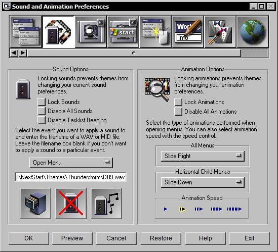
Sounds and animations are usually specified by the theme author. You can override this and always use or favorite combination of sound and animations by selecting the Lock Sounds and Lock Animations options. You can also globally enable or disable Sound and Animations. If disabled globally, no sounds will be heard and no animations performed even if the theme you are currently using has them.
In Sound Options, you can define particular sounds to match particular menu events, such as opening and closing of menus, rollup, always on top, and also you may define a sound for the execution of a particular item (selection and running of a program or command). You can also specify sounds for the expanding and collapsing of the NextSTART startbar.
If you select Disable Tasklist Beeping, NextSTART will no longer beep when a window is flashing on the Startbar and requires your attention.
In Animation options, you may choose from a variety of menu-opening behaviors such as slide down, slide right or left, explode from center, etc... You may also choose the Animation Speed by selecting from the arrows shown. Left is faster, right is slower. You might need to experiment with the speed setting to find the most appropriate value for your system.
The choices available here are relevant if you allow NextSTART to handle your system tray and taskbar, instead of Explorer.
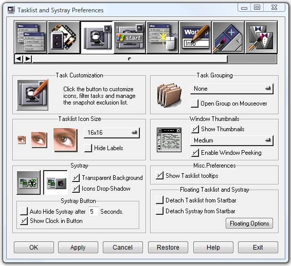
The Task Customization button opens a dialog where you can choose different icons to represent your applications in the task list (note that you can also quickly customize task icons by dropping an .ico or .png file into the task button itself), prevent specific applications from appearing in the task list (or only appearing when minimized) and prevent NextSTART from making window thumbnails of troublesome applications under XP (for instance, you will probably want to exclude Windows Media Player because taking it's snapshot can cause the video overlay window to come to the foreground even if the player itself is hidden beneath other windows). You can select an application either by their executable name ( i.e. 'nextstart.exe' ) or by providing a word that exists in the application's window title ( e.g.; 'WinWord' ). If you are running WorkShelf, it will use any task customization options chosen here in its Tasks shelf and on any docks displaying a list of running applications.
New tasks are added by default to the end of the tasklist but in the Task Grouping section you can also have NextSTART sort the tasklist by similar tasks (e.g.; tasklist buttons for documents opened by the same program are always displayed together in the same area of the tasklist) or group similar tasks into a single button. The latest option allows you to create more available space on the tasklist, which can be important if you have many windows open at the same time - for instance, if you have four Notepad windows open, the four notepad tasklist buttons will be grouped into a single task button named 'Notepad'. Clicking on this button will make a menu pop up with the titles of the four different notepad windows. The button holding grouped tasks also displays the number of tasks grouped into that button (e.g.; using the latest example, '4*' would be displayed next to the 'Notepad' description).
You can choose to have 16x16, 32x32 or 48x48 icons representing your tasks in Tasklist Icon Size. You can also override the current theme settings and configure task buttons not to display labels.
As stated above, NextSTART, under XP and above, has the ability to show thumbnails of windows that appear in the tasklist. In the Window Thumbnails section you can enable or disable this feature as well as select the size of the thumbnail, ranging from very small (64x64 pixels) to very large (256x256 pixels). Here you can also disable the windows "peek" function which activates when you mouse over a window thumbnail, where all windows except the one associated to that thumbnail are automatically hidden until you move the mouse pointer away from the thumbnail.
The Systray can be shown individually or next to a control button. If you choose the button style, you may also choose to Auto Hide the Systray and define the time-lapse for this to occur, otherwise you can manually toggle the systray on and off view by clicking on the button. Clicking and dragging the button will also allow you to position the systray anywhere on the screen, provided the systray is detached from the Startbar, of course (see below). The current time is displayed on the systray button if you select Show Clock in Button. The systray background can also be made transparent, but be warned that animated systray icons might not display very well if this option is selected. If the systray is transparent, icons in it can be rendered with a Drop Shadow.
Note that capturing the Windows systray into NextSTART and rendering it with a transparent background is not without it's problems: if the background texture of the original systray is too complex, NextSTART might not be able to completely eliminate the background. Furthermore, if some of the icons in the systray change shape or animate, the 'transparency mask' can become out of synch with the actual systray icons. For this reason, it is always a good idea to associate the 'Refresh Systray' internal command to an hotspot and specify a hot key to activate it (for instance, F9). This way, a single key press would be all it took to quickly correct any systray rendering problems.
Under Miscellaneous preferences you can toggle the display of the tooltip that pops up to display the full name of the task your mouse pointer is currently over.
The NextSTART tasklist and systray can be shown independently on different areas of the screen or inside the NextSTART startbar (provided the theme supports a startbar, of course, which all recent themes do). In the Floating Tasklist and Systray section you can force NextSTART to detach the Systray or the Tasklist from the startbar and show them somewhere else on the screen. The Floating Options button displays a dialog where you can select what happens when the tasklist and/or systray are detached from the startbar:
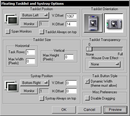
Note that when inside the startbar, the tasklist and systray position, orientation and transparency settings specified here are overridden by the startbar settings.
Tasklist Position and Orientation determine the location and orientation of your detached tasklist. The tasklist position may be in any of the four corners of your screen and orientation may be either horizontal or vertical. In multi-monitor systems you can also specify which monitor holds the tasklist or even make it span all existing monitors. Note that you can also position the the tasklist anywhere on the screen by clicking and dragging it to the position you want, unless the Disable Dragging setting below is currently active.
The space used by the whole tasklist can also be defined in the Tasklist Size section - if you don't specify a maximum size in pixels the tasklist will grow dynamically as more and more tasks are added to it, using all the available screen space if necessary. If the tasklist is horizontally orientated, you can also specify how many rows to display. The tasklist will automatically display scroll buttons if there are more tasks than those that fit in the available screen space.
On Windows 2000 and XP systems, the tasklist can be made semi-transparent. If you use the transparency option then you can also select a mouse over effect, in which either the icon or the whole button under the mouse pointer becomes opaque (and therefore highlighted since the remaining task buttons remain semi-transparent).
If the Dynamic Width option is selected as the style of task buttons, task buttons will automatically shrink in width in order to accommodate as many tasks as possible into the space available for the tasklist (much like the standard Windows taskbar buttons do). Since NextSTART shrinks the task buttons by cropping the text description of the tasks, this option is only available if the theme supports task captions (some themes, specially older ones, only display task icons - the actual text description being displayed in a tooltip as you mouse over the icon).
A detached Systray can also be positioned in any of the four corners of your screen (though generally not in the same position as your tasklist). Note that you can only drag the systray around the screen by clicking and dragging on the optional systray button. If you have it disabled, then the only way to change the systray position is by specifying its screen coordinates in this section.
Finally, to prevent accidental drags, you can lock the systray and the tasklist in place by selecting the Disable Dragging option.
Note that NextSTART's task list recognizes 3 types of mouse clicks: by default, left clicking on a task list button will restore/bring forward the associated application, right-clicking will minimize it and middle-clicking will 'kill' the application. There is no confirmation request for terminating an application, so be careful. If you CTRL + Right Click a task list button you get the task's context menu. If you SHIFT-CTRL-Middle click on a task list button, you will kill all related instances of the same application (e.g.; all currently opened Internet Explorer windows). You can also 'drag over' a document or file onto a tasklist button - this will restore/bring onto the foreground the associated window/application. You can select which mouse click does what on the tasklist using the Mouse Settings dialog in the Global Preferences tab.
The choices available here are relevant if you choose to allow NextSTART to handle your system tray and task bar, instead of Explorer.
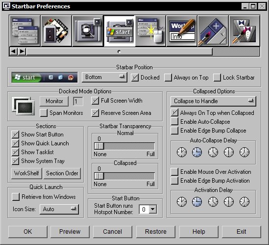
The startbar acts as a container for a Start button, the Tasklist, Systray, Quick Launch buttons and WorkShelf's desktop modules. The advantage of the NextSTART startbar over the standard Explorer's taskbar is that the NextSTART version, besides being skinnable, is a lot more flexible and customizable. Note that to have a startbar, the theme must support it (most, if not all, newer themes do, but don't be surprised if you install an old theme and your startbar disappears from sight, replaced by a floating tasklist and systray).
In the Startbar section you can determine the position (relative to a screen edge) and orientation of the NextSTART startbar, or even disable it entirely so that the tasklist and systray are displayed on your desktop as separate entities. Choosing Top or Bottom for the location of the startbar will orientate the startbar horizontally, while choosing Left or Right will orientate it vertically. To move the startbar to a different location on the desktop when in floating mode, click on an empty area of the startbar and drag. To resize it, drag one of the edges. Selecting Always on Top will make the startbar be on top of all other windows and selecting Lock Startbar will lock a floating startbar into position and prevent it from being dragged accidentally (relevant only when the startbar is 'floating', i.e.; not docked to a screen edge).
The startbar can be either Docked to the screen edge selected in the Startbar section or floating anywhere on the screen. If you also select the Full Width option, then the startbar will always run edge to edge when in docked mode, otherwise you can shrink or enlarge the startbar at will by clicking and dragging its edges, just as you do with a regular window. In multi-monitor systems you can select which monitor holds the startbar, and you can even make it span the width of all your monitors. If you set the startbar to Reserve Screen Area, maximized windows will not cover it when the Startbar is docked to one of the four screen edges.
The Startbar can be made semi-transparent on Windows 2000 and XP systems. Move the slider to the right to increase the degree of transparency. Remember that if you accidentally make your startbar completely invisible by moving the slider all the way to the right (fully transparent) you can still access the NextSTART Preferences screen by pressing CTRL-F12 or double clicking the NextSTART icon in the systray.
The NextSTART startbar, as stated above, primarily acts as a container for the NextSTART Start Button (which activates hotspot 0 by default when clicked on), the Quick Launch buttons, the tasklist and the systray. Optionally, if you are running WorkShelf, it can also act as a container for the WorkShelf's desktop modules like the clock, recycler, weather monitor, etc... Each of these elements is called a startbar Section, and you can choose which section to display on your startbar and which section not to. In addition, you can also choose the order of these sections by clicking on the Section Order button, so that, for instance, the start button is placed at the far right of the startbar, at the left or even somewhere in the middle. You can also select which WorkShelf modules are 'captured' into the NextSTART startbar by clicking on the WorkShelf button. Note that if you choose to capture WorkShelf desktop modules into the NextSTART startbar, the startbar will automatically resize itself in order to accommodate the largest module. In the WorkShelf dialog you can also prevent the startbar from capturing unreasonably large WorkShelf desktop modules (which could be a problem if you change themes often) and capture the WorkShelf desktop modules as icons rather than the wildly sized desktop versions. Modules captured as icons have, by default, the same size as the icons in the tasklist, but you can also specify an independent size, from 16x16 to 128x128.
The NextSTART Quick Launch section in the startbar is very much like the Explorer Quick Launch bar except that, being hotspots, Quick Launch items can be used not only to run programs but also to run internal NextSTART commands and display menus. When NextSTART starts up, it automatically copies items in the Explorer's Quick Launch bar into the NextSTART Quick Launch section. This behavior can be disabled by unselecting the Retrieve from Windows option so that the NextSTART Quick Launch area remains unchanged unless you manually add or delete items to and from it.
To add items to the Quick Launch section of the startbar, simply drag the file you want to add from an Explorer window and drop it into the Quick Launch area (or add a Quick Launch Button type of hotspot in the Hotspot Preferences tab). You can re-order Quick Launch buttons by dragging them around in the Quick Launch section. Right-clicking on a Quick Launch button will display a context menu that allows you to delete the button or change it's properties (tooltip text, icon, etc...). Quick Launch icons in the startbar have, by default, the same size as the icons in the tasklist, but using the QuickLaunch Icon Size pull up menu you can specify an independent size, either 16x16, 32x32 or 48x48.
The Start Button is, by default, associated to hotspot 0, which in turns displays the main NextSTART menu. You can change which hotspot is associated to the Start Button (and therefore what happens when you click on it) in the Start Button section.
The Startbar can be collapsed in order to use as little screen space as possible until it is needed again. The pull up menu in the Collapse Options section allows you to define one of two collapse modes: if Collapse to Handle is selected, the startbar displays a small handle at the end. Clicking on this handle will make the startbar collapse so that only the handle is visible. Clicking on this handle again will re-expand the startbar. Selecting Collapse to Edge, on the other hand, will make the startbar collapse in such a way that only a small edge is visible. This is similar to the Auto-Hide function of the standard Windows taskbar, specially if the startbar is docked to one of the screen edges. Selecting On Top when collapsed will ensure the collapsed startbar is always visible by keeping it on top of all other windows. The transparency of the startbar when collapsed can also be set on Windows 2000/XP systems. If Enable Auto-Collapse is selected, once the mouse pointer is no longer over it the startbar will automatically collapse itself after the period of time specified in Auto-Collapse Delay elapses. If Enable Mouse Over Activation is selected, the startbar will automatically un-collapse itself as soon as the mouse pointer floats over it. To prevent accidentally un-collapsing the startbar, you can increase the mouse over activation delay in Activation Delay. Another way to un-collapse the startbar is by bumping on the associated screen edge if Enable Edge Bump Activation is selected.
The Hotpots tab allows you to configure up to 72 independent menus or actions. Each menu or action can be associated to a specific application or window. You can also define where the menus show up and where you have to click to make it happen.
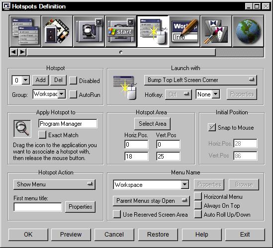
In the Hotspot section you can add, modify or delete hotspots. You can have a maximum of 72 different hotspots (0 to 71). Press the Add button to add a new hotspot, the Del button to delete the current hotspot or, alternatively, click on the combo to choose the hotspot you want to modify.
Hotspots can be clustered in Groups. Hotspots in the same group are self exclusive, that is, you can only have a menu within a hotspot group on screen at a time. This can be useful if you are mapping several hotspots to, say, a desktop bitmap holding several items ( like a menu ), but you only want to have one of those items active at a time. Clicking on a hotspot would then close any open menu associated to a different hotspot in the same group before displaying the new menu. This pretty much mimics the normal sub-menu system in NextSTART: Click on a sub-menu item and any previously open sub-menus close before the new sub-menu is displayed.
If, on the other hand, you want to have multiple menus associated to different hotspots open at the same time, then you should give their hotspots different group names. Like this, if you have, say, a menu associated to hotspot 0 open and then click on hotspot 1, the menu associated to hotspot 1 pops up *without* the menu associated to hotspot 0 being automatically closed.
Selecting the Disabled checkbox will mark that hotspot as inactive. This enables you to temporarily prevent an hotspot from activating without having to delete it from the hotspots list.
The AutoRun option allows you to automatically open the menu or perform the action associated to a specific hotspot when NextSTART runs. This can be very useful if you wish to have certain options automatically executed after a reboot or your default menu automatically open. You can define hotspots which, not being associated to any windows or screen edges/corners, are created only to be run once at startup.
In the Launch With section you can define which mouse button or screen edge/corner is used to launch individual menus. You may also define a Hotkey here to use instead of a mouse action. The default Launch With option is the Left click on Hotspot Button, which will attach an hotspot to a button that NextSTART automatically displays on your desktop. This button can be easily dragged anywhere on the screen, and its size, icon, tooltip, caption, etc, can be defined by clicking on the Properties button. A hotspot button is, in fact, a visible hotspot. Another Launch With option is the Left click on Quick Launch button, which creates a new Quick Launch button on the Quick Launch section of the NextSTART's startbar. For this last type of hotspot to be visible, the theme must support a startbar and the Quick Launch section of the startbar must be enabled (see the Startbar Preferences section of this User Guide for more information on Quick Launch buttons and the startbar).
In the Apply Hotspot to and Hotspot Area sections you define where the hotspot is located. The application name box holds the name of the window you want to ‘own’ the current hotspot, that is, the hotspot will only exist on that particular window. If you want to display a menu by clicking on the Windows desktop, then this box should be left blank or hold the words ‘Desktop’ or 'Program Manager'. You can also use the Find Window tool to find the name of the window you wish to apply a hotspot to: click and drag the magnifying glass icon on top of the target window and NextSTART will automatically retrieve the appropriate name for it. If you leave the Exact Match checkbox blank, NextSTART will only perform a partial match for the contents of the application name box, that is, the hotspot will be activated even if the words in it are only part of the title of the window you just clicked on. This is specially useful for applications like Excel, where the current open document is part of the windows title (for instance, 'Excel - Book1.xls'). If you specify an exact match and the contents of the application name box are 'Excel - Book1.xls', the hotspot will only be activated when you're working on that particular document. On the other hand, if Exact Match is unchecked and the application name box just holds 'Excel', the hotspot will be activated regardless of the current document name.
The Horiz.Pos. and Vert.Pos. boxes hold the coordinates of the hotspot – in pixels – relative to the upper left corner of the owner window/desktop. These four values thus define a rectangle inside this window, which, when clicked on, will activate the hotspot. The Select Area button enables you to draw that rectangle yourself instead of having to type in the actual physical coordinates. When you press this button the NextSTART preferences window is hidden and the cursor turns into a cross-hair. Click on the place you want the hotspot to start and drag to draw a rectangle. When you release the button the Horiz.Pos. and Vert.Pos. boxes will have been filled with the correct coordinates of the hotspot.
A hotspot – and corresponding menu/action – can, as stated before, be associated to the Windows desktop itself or to a particular window. The difference is important. If you define a hotspot associated to a window, the menu will only appear when that window is on screen and you click inside it and on the hotspot area - move the window and the hotspot moves with it.
The Initial Position and Hotspot Action sections are where you define what the hotspot does, the title of the first menu that shows up – in the First menu title box – and the coordinates, in pixels and relative to the upper left corner of the owner window, at which this menu should appear. If you previously used the Select Area button to let NextSTART know where the hotspot is, then the Horiz.Pos. and Vert.Pos. boxes - which hold the menu’s top left coordinates - will already have been automatically filled. By default NextSTART always shows the menu just after the hotspot rectangle. If, on the other hand, you prefer the menu to show up at the exact place where you clicked on the hotspot, then enable the Snap To Mouse option. This will make the menu snap to the current mouse position. Note, however, that the menu will never pop-up off-screen, so NextSTART might automatically adjust its initial position to prevent this from happening.
When a menu shows up, its position is always relative to that of the window that owns the hotspot. However, since the Windows desktop is fixed and covers the entire screen area, a menu associated to the desktop will always appear at the same absolute position. Not so if you associate the hotspot to a window or application. In such a case the initial position of the menu will depend on the screen position of it’s owner window. Move the window to the right and the next time you click on that hotspot – which also moves with the window - the menu will have moved the same exact distance to the right (unless this would cause it to be displayed outside the screen area, of course).
If you don’t specify a menu title in the First menu title box, then the title used for the first menu of this hotspot will be the name of the initial folder or the actual menu name.
The Properties button in the Hotspot Action section allows you to specify different themes to be used for this hotspot only, or to execute programs or play sounds specific to this hotspot.
The contents and name of the section at the right of Hotspot Action depend on the type of action you chose for this hotspot. This action can be one of the following types:
If you selected the action as 'Show Folder', under Menu Name, Properties: The All Files, Exec Only and CPL Only options allow you to filter the files that are displayed in the menu:
All Files : All files and folders are displayed (default).
Exec Only : Only folders and files with the extension exe, com, bat, pif, cpl and lnk (shortcuts) are displayed.
CPL Only : Only *.CPL files (Control Panel files) are displayed. Folders are NOT displayed.
User Specified : Shows folders and allows you to specify which type of files are displayed ( e.g.; *.txt;*.doc ).
In Folder Path and Folder Path 2 you can define up to two folders whose contents will be displayed by the menu. Why two folders? Under NT 4 there are two main program folders. The ‘All Users’ folder – usually at C:\WINNT\Profiles\All Users\Start Menu\Programs – and the current user folder, which, for most users who run NT in their home PCs, is at C:\WINNT\Profiles\Administrator\Start Menu\Programs. By specifying the two paths when running under NT, the user can combine these two folders into a single menu.
But NextSTART is not limited to only displaying the contents of the programs folder. Here is a list of other useful folders for users of Win9x:
‘C:\Windows\Recent’ – Holds shortcuts to your most recently used documents.
‘C:\Windows\Favorites’ – Holds the contents of Window’s Favorites menu.
‘C:\Windows\ Desktop’ – Holds the contents of the Window’s desktop.
If, on the other hand, you selected 'Run Program' as the hotspot action, the Menu Name and Properties buttons allow you to specify the program's arguments, start up directory and if it runs minimized, maximized or in a normal window.
For any hotspot action that leads to a menu, you can also specify if the menu is vertical or horizontal, if it is always on top or not, and what happens when you execute one of its items: if 'Close Menus Automatically' is selected, all menus and sub-menus belonging to that hotspot are automatically closed. With 'Parent Menus stay open', only any open sub-menus are closed. With 'All Menus Stay Open', no menus or sub-menus are closed when a menu item is executed.
If Auto Roll Up/Down is enabled, parent menus automatically roll-up when the mouse pointer leaves the menu area (after a pre-set amount of time) and automatically roll down and come to the foreground when the mouse pointer re-enters their titlebar area. Auto Roll Up/Down only applies to parent menus. A menu with an open sub-menu does not automatically roll up, nor do menus with no titlebar (only menus with titlebars can be rolled up for obvious reasons). If you want to roll up a menu and keep it from automatically rolling down, then roll it up manually by clicking on the titlebar's roll up button or by using the appropriate mouse click on the titlebar.
Enabling Use Reserved Screen Area will allow a menu associated to the current hotspot to pop up within a screen reserved area (see the Global Preferences Tab section on this User Guide for more information on reserved screen areas). Maximized windows do not overlap reserved screen areas, so your menu would always be at least partially visible.
Create your new menus here, group your favorite or most used applications or games together, or perhaps make a system menu holding your most useful commands.
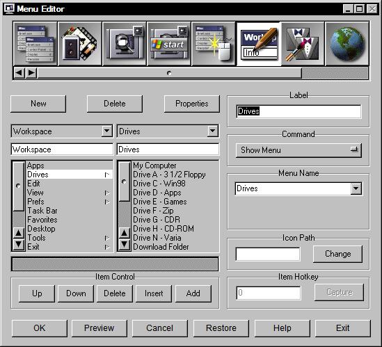
NextSTART comes with a default menu. Make a backup of your current NextSTART configuration in the Global Preferences tab and experiment with the Menu Editor to get a feel on how it works.
New creates a new menu, Delete is useful if you change your mind or no longer require the menu and Properties allows you to assign particular properties to a menu.
Once you have created your new menu, you can then Add items to it, Insert them at particular points in it, or move existing items in your menu up or down. Delete is also an option you may wish to use. When you have chosen 'Add', click on the command button and you will be shown a number of choices as defined below.
Each item in a menu can be one of the following types:
As you choose one of these options, new options become available. For example, choosing to Run Program then gives you options to browse for your program and assign particular properties to it, and choosing Run Internal Command will then make available a dropdown list box with the currently available commands. Please note that some of these commands are NT/2000/XP specific and as such will not apply to Windows 9x. For a list of all the available NextSTART internal commands, please refer to the Internal Command List .
The menus you have created may now be assigned to hotspots (see above).
Below is an example on how to create a new menu:
The Appearance Preferences Tab
This is where you can specify the appearance of the individual NextSTART components, from menus to the startbar, etc...
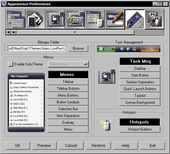
In the Bitmaps Folder section you can specify the folder from where NextSTART can retrieve any bitmaps necessary to compose the current theme. Bitmaps Folder can be defined by typing the path directly or by pressing the Browse button. If creating a new theme, you will need to have manually created the folder (in Windows Explorer or your file manager of choice) and placed your bitmaps in it, prior to this. Alternatively, and this is a popular way of creating new themes, select an existing theme in the Theme Management tab that is as similar as possible to the theme you want to create, change its name and click on the Save button. NextSTART will automatically create a new folder based on the new name, copy the previous theme's bitmaps and settings into the new folder and update the Bitmaps Folder setting to reflect the new location. You can then start changing settings and updating the bitmaps to create your theme.
Enabling sub-themes allow you to have different menu themes for the main and child menus. When you enable sub-themes NextSTART automatically creates a 'SubTheme' folder inside the main theme folder, and all bitmaps and settings for child menus will/should be stored there.
The Menus section gives you access to configuration panels where you can specify the skinning settings for each of the menu's component. The Task Management section does the same for items related to task management and the Hotspots section allows you to configure the look of Hotspot buttons.
For a complete list and description of each of these skinning configuration panels, please navigate to the Working with Themes chapter below.
This is where you load and import new themes, or save out or export your own newly created themes.
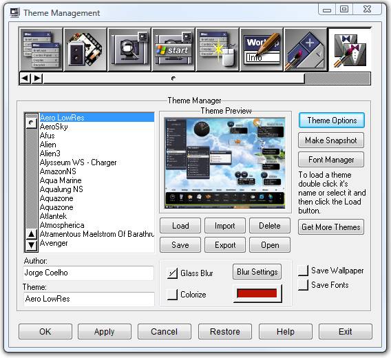
The list at the left in this panel is where you make a choice from the number of pre-installed themes which come with NextSTART. Once you have created your own themes, or imported new ones, they will also be listed here. To load a theme, double click its name or select it from the list and click on the top diskette button - the theme will be immediately applied. You can also select a theme and then click on the OK or Preview buttons at the bottom.
When you get tired of the themes that come with NextSTART, you can download hundreds more from the Internet by clicking on the Get More Themes button - this will take you to the Themes page at the Winstep web site where a list of sites that host Winstep themes is available.
When running under Vista or above, the Glass Blur effect causes semi-transparent menu and startbar backgrounds to automatically blur whatever is visible behind them, i.e. apply the same effect Windows Vista does to window borders when Aero is enabled. You can also Colorize backgrounds from here, a very useful feature that gives you quick access to thousands of different color variations on the same theme.
The Import Theme button (the box with the arrows pointing out button) shows a dialog box where you can import Winstep themes you have downloaded from the internet. You should browse to the directory containing your downloaded theme and press the import button once you have selected your file - alternatively you can also drag & drop the .zip or .xtreme file to the filename box in the dialog. If you are updating an existing theme, checking the Always Overwrite Files option will prevent NextSTART from issuing an overwrite warning for each matching file in the theme. If you placed all your newly downloaded theme packs in the \winstep\autoinstall folder, NextSTART detects their presence and Autoinstall will show up in the filename box. Pressing the Import button will then install all the themes you have in this directory.
WARNING! Theme files stored in the Autoinstall folder will be automatically deleted after installation. Theme packs stored in the Autoinstall folder will also be automatically installed when NextSTART runs.
The Delete button allows you to delete the currently selected theme and all its files, but not without first prompting you for confirmation. The theme folder will be moved to the Windows Recycle bin, where you can retrieve it from if you later change your mind.
The Save Theme button allows you save your newly created theme, or indeed any alterations you may make to the defaults as loaded by other themes. Before saving a theme you should type your name in the Author box and the name of the theme in the Theme box. You should also check the Save Wallpaper option if you want your current wallpaper to be part of the NextSTART theme, and the Save Fonts option if your theme uses any special fonts that should be part of the theme. If the wallpaper is a bitmap in BMP format, it is a good idea to convert it to JPG before exporting the theme, since this will drastically reduce its size (note that NextSTART automatically converts JPG wallpapers to BMP when loading a theme because some OS versions do not support wallpapers in JPG format). Before saving your theme, you might also want to make a Theme Preview Snapshot, which will be saved together with the theme. For this you should re-arrange your desktop in a manner that shows off your theme and then click on the Make Snapshot button. NextSTART will automatically hide the Preferences window and take a snapshot of your desktop. Note that the Theme Preview snapshot is shared by both NextSTART and Workshelf - there is no need to make one for each application.
The Export theme button is a useful option if you plan to distribute your themes to others. Once a theme has been selected on the list box at the left, you can, by simply pressing the export button, automatically export it to a .xtreme file which will take the name of your theme and place it in the export directory (or on a directory of your choice). The export process will export all the files contained in the theme directory and any sub-folders.
Clicking the Open Theme Folder will show the contents of the currently selected theme in an Explorer window. Useful when you want to manipulate the individual theme bitmaps or configuration files.
The Font Manager button opens a dialog listing all the fonts used by the currently loaded theme. From there you can quickly swap one font for another and even install any fonts that exist in the theme folder but were not previously installed.
The Theme Options button leads to a dialog that allows you to choose to prevent changes to your current wallpaper, among other options. Since some themes come with fonts, enable the Automatically Install Fonts option in this dialog if you wish fonts to be automatically installed on your system (this option is enabled by default). Here you can also select if theme integration with WorkShelf is active or not (if active, changing a theme in NextSTART will automatically change the theme in WorkShelf - providing, of course, that you are running WorkShelf and that there is a matching WorkShelf theme).
There are many theme designers constantly making new themes for NextSTART and Workshelf. Users who do not wish to do so can either use one of the many themes that come by default with NextSTART or they can download hundreds of new themes from sites such as those listed at http://www.winstep.net/themes
The Global tab allows you to configure miscellaneous elements of NextSTART.
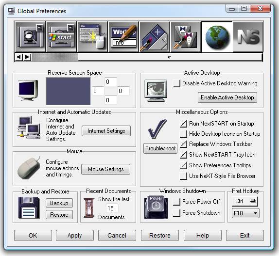
The Reserve Screen Space section allows you to prevent maximized windows from using all the desktop area (much like the Windows taskbar reserves an area at the edge of the screen for itself). This can be very useful if you want to make sure that maximized windows do not cover the NextSTART task list icons, for instance, or other areas at the edges of your desktop. Here you can specify how many pixels at the top, left, bottom and right edges of the screen are protected from being covered by maximized windows. Any maximized windows already open are automatically resized to use the new available desktop area when you press the OK button, and existing windows are 'pushed' out of the reserved areas (unless this would also push them off the screen). Note that the NextSTART Startbar can be made to automatically reserve screen area, and that this function is independent from the settings placed here.
The Disable Active Desktop Warning option allows you to prevent the warning issued by NextSTART every time it runs if it finds Active Desktop enabled. This is useful if you chose not to disable Active Desktop. The Enable Active Desktop button will re-enable Active Desktop if you have previously allowed NextSTART to disable it and now wish to get it back. Note that you might have to restart your system to re-enable Active Desktop.
NextSTART can regularly check to see if newer versions are available (note that this requires an active Internet connection):
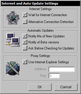
In the Automatic Updates section you can disable this function or have NextSTART silently check on the background and only notify you when new updates are available.
The 'Wait for Connection' checkbox should be checked if you do not have a permanent connection to the internet - NextSTART will then wait until you are on-line before attempting to check for updates. The 'Alternative Detection' checkbox selects an alternative option to detect an internet connection and should be used if you are unable to connect or are having problems with the normal method (e.g.; NextSTART never connects or thinks the user is always connected).
If you are behind a Proxy, NextSTART will automatically use the Proxy settings defined in the Connections tab of Internet Explorer, or you can manually specify the Proxy server and port here.
The Mouse Settings button will open a dialog where you can configure all the settings related to mouse actions and timings:
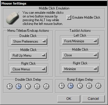
You can emulate middle clicks on systems where the mouse does not have a middle button by pressing the ALT key together with the Left mouse button. If this creates problems with other functions you can disable the emulation by unselecting the Emulate Middle Click option.
In Title/Endcap Mouse Actions you can specify the action associated to a specific mouse click on a menu titlebar or endcap. Available actions are Show Preferences, Close Menus, Close Sub-Menus, Roll Up Menu, Always on Top and Rotate Menu.
In Tasklist Mouse Actions you can specify the action associated to a specific mouse click on a NextSTART tasklist tile. Available actions are None (no action), Minimize, Bring to Front, Close, Front/Minimize (Windows default action, brings the window to the front if not the active window already or minimizes it otherwise), Tasks Menu, Minimize Similar, Restore Similar and Close Similar.
The Double Click Delay can be used to specify if you want NextSTART to distinguish between single and double mouse clicks on a hotspot. This can be important if your hotspot covers the entire screen or you have icons spread all over the desktop. NextSTART is unable to distinguish if you are clicking on an empty area of the desktop or on an icon and it can be terribly confusing to double-click on an icon and have both your application and a NextSTART menu launched at the same time. To avoid this, when you first click on a hotspot NextSTART waits a little longer to see if there is another click coming. Once it has waited the time specified in Double Click Delay with no further clicks happening, it launches the menu. The default Double Click Delay value is calibrated with the normal interval Windows uses to distinguish between double clicks and two single clicks in quick succession. If this is not enough for you or you normally double click faster, you can respectively increase or decrease this value. Just remember that the higher the value the longer it will take for your menus to be launched. The opposite is also true. In fact, if your desktop hotspot does not cover any icons, you can set this delay to the minimum and your menus will launch immediately.
The Bump Edges Delay is similar to the Double Click Delay but controls how long NextSTART takes to recognize that you are bumping your mouse onto a screen edge or corner. This can avoid annoying accidental menu misfires when you are working on maximized applications. .
The Backup and Restore buttons allow you to save and retrieve all your current NextSTART settings. Please see here for more information.
In the Recent Documents section you can specify how many documents are displayed by the Recent Documents menu (XP only). The default is 15.
The Force Power Off and Force Shutdown are options you might want to try if NextSTART's 'Shutdown Windows' internal command does not work properly for you (e.g.; Windows hangs on shutdown or displays the 'It's now safe to turn off your computer' message instead of automatically powering off).
In Preferences Hotkey you can define a new hot key combination to invoke the preferences window or simply disable this function altogether by selecting None from the dropdown box. The default key combination is CTRL-F12.
The Troubleshoot button displays a dialog from where you can reset NextSTART settings, menus and hotspots back to their installation defaults..
Enabling Run NextSTART on Startup will make NextSTART automatically run every time you restart Windows. With this option selected you do NOT need to place a shortcut to NextSTART on your Startup folder.
If you select Hide Desktop Icons on Startup, NextSTART will automatically hide your desktop icons every time it runs, providing a cleaner desktop.
You should uncheck Replace WindowsTaskbar if you don't want NextSTART to replace the Windows taskbar.
If you uncheck Show NextSTART Tray Icon you can prevent NextSTART from adding an icon to the Systray (also known as the Windows Notification Area).
Un-checking Show Preference Tooltips will disable the tooltip help given by NextSTART that explains the actions of the graphical buttons in the preference tabs.
If you prefer NextSTART to use the built-in NeXT-style file browser rather than the standard Windows dialogs to open and save files, select the Use NeXT style File Browser option.
The following is a list of all the NextSTART internal commands. Some of those internal commands might not be available to you if the Operating System does not support them or if you don't have the necessary application installed.
|
Internal Command Name |
Windows 9x/ME | Windows NT4 | 2000/XP/Vista |
| NextSTART Help | Yes | Yes | Yes |
| NextSTART Preferences | Yes | Yes | Yes |
| Exit NextSTART | Yes | Yes | Yes |
| Quick Exit NextSTART | Yes | Yes | Yes |
| Exit Winstep Xtreme | Yes | Yes | Yes |
| Quick Exit Winstep Xtreme | Yes | Yes | Yes |
| Version Info | Yes | Yes | Yes |
| Backup NS Settings | Yes | Yes | Yes |
| Restore NS Settings | Yes | Yes | Yes |
| Check for Updates | Yes | Yes | Yes |
| Show Tip of the Day | Yes | Yes | Yes |
| Show/Hide Desktop Modules | Yes | Yes | Yes |
| Bring WorkShelf Forward | Yes | Yes | Yes |
| More Themes | Yes | Yes | Yes |
| Capture Desktop | Yes | Yes | Yes |
| Show Start Menu | Yes | Yes | Yes |
| Show Volume Control | Yes | Yes | Yes |
| Run | Yes | Yes | Yes |
| Search | Yes | Yes | Yes |
| Find Computer | Yes | Yes | Yes |
| Windows Help | Yes | Yes | Yes |
| Control Panel | Yes | Yes | Yes |
| My Computer | Yes | Yes | Yes |
| Network Neighborhood | Yes | Yes | Yes |
| Printers | Yes | Yes | Yes |
| Briefcase | Yes | Yes | --- |
| Start Screen-Saver | Yes | Yes | Yes |
| Power Off Monitor | Yes | ||
| Sleep | Yes | Yes | Yes |
| Hibernate | --- | --- | Yes (XP/Vista) |
| Log Off | Yes | Yes | Yes |
| Quick Log Off | Yes | Yes | Yes |
| Restart Windows | Yes | Yes | Yes |
| Quick Restart Windows | Yes | Yes | Yes |
| Shutdown Windows | Yes | Yes | Yes |
| Quick Shutdown Windows | Yes | Yes | Yes |
| Fast User Switching | --- | --- | Yes |
| Show Recycle Bin | Yes | Yes | Yes |
| Empty Recycle Bin | Yes | Yes | Yes |
| Clear Recent Documents | Yes | Yes | Yes |
| Show Desktop | Yes | Yes | Yes |
| Minimize All Windows | Yes | Yes | Yes |
| Restore All Windows | Yes | Yes | Yes |
| Show Desktop Icons | Yes | Yes | Yes |
| Hide Desktop Icons | Yes | Yes | Yes |
| Hide/Show Desktop Icons | Yes | Yes | Yes |
| Show Desktop Folder | Yes | Yes | Yes |
| Rebuild Icon Cache | Yes | Yes | Yes |
| Show Taskbar | Yes | Yes | Yes |
| Hide Taskbar | Yes | Yes | Yes |
| Hide/Show Taskbar | Yes | Yes | Yes |
| Show Tray on Desktop | Yes | Yes | Yes |
| Show Tray on Taskbar | Yes | Yes | Yes |
| Refresh Systray | Yes | Yes | Yes |
| Show Tasklist on Desktop | Yes | Yes | Yes |
| Hide Tasklist from Desktop | Yes | Yes | Yes |
| Hide/Show Tasklist | Yes | Yes | Yes |
| Enable NS Task Management | Yes | Yes | Yes |
| Disable NS Task Management | Yes | Yes | Yes |
| Enable/Disable NS Task Management | Yes | Yes | Yes |
| Task Manager | Yes | Yes | Yes |
| Copy Disk | Yes | Yes | Yes |
| Format Floppy Disk | Yes | Yes | Yes |
| Eject CD-ROM | Yes | Yes | Yes |
| Close CD-ROM Door | Yes | Yes | Yes |
| Eject Drive x: | --- | Yes | Yes |
| Close CDROM x: Door | Yes | Yes | Yes |
| Add New Modem | Yes | Yes | --- |
| Add New Connection | Yes | --- | --- |
| Connect to the Internet | Yes | Yes | Yes |
| Disconnect Modem | Yes | Yes | Yes |
| WinAmp Previous | Yes | Yes | Yes |
| WinAmp Play | Yes | Yes | Yes |
| WinAmp Pause | Yes | Yes | Yes |
| WinAmp Stop | Yes | Yes | Yes |
| WinAmp Next | Yes | Yes | Yes |
| WinAmp Volume Up | Yes | Yes | Yes |
| WinAmp Volume Down | Yes | Yes | Yes |
| WinAmp Show Playlist | Yes | Yes | Yes |
| WinAmp Show Equalizer | Yes | Yes | Yes |
| WinAmp Show Preferences | Yes | Yes | Yes |
| Accessibility Properties | Yes | Yes | Yes |
| Add New Hardware | Yes | --- | Yes |
| Add New Printer | Yes | Yes | Yes |
| Add-Remove Programs | Yes | Yes | Yes |
| Console Options | --- | Yes | --- |
| Date & Time Properties | Yes | Yes | Yes |
| Desktop Themes | Yes | Yes | Yes |
| Display Properties | Yes | Yes | Yes |
| Fax Properties | --- | Yes | Yes |
| Game Controllers | Yes | Yes | Yes |
| Internet Options | Yes | Yes | Yes |
| Keyboard | Yes | Yes | Yes |
| Mail and Fax Options | Yes | --- | --- |
| Mail Options | --- | Yes | --- |
| Mail Postoffice Options | Yes | --- | --- |
| Mouse Properties | Yes | Yes | Yes |
| Modem Properties | Yes | --- | --- |
| Multimedia Properties | Yes | Yes | Yes |
| Network Properties | Yes | Yes | Yes |
| ODBC32 Data Admin. | Yes | Yes | Yes |
| Password Properties | Yes | --- | --- |
| PC Card Options | --- | Yes | --- |
| Port Options | --- | Yes | --- |
| Power Management | Yes | Yes | Yes |
| Regional Settings | Yes | Yes | Yes |
| Scanners and Cameras | Yes | --- | Yes |
| Server Options | --- | Yes | --- |
| Show Fonts | Yes | Yes | Yes |
| Sounds | Yes | Yes | Yes |
| Speech Properties | Yes | Yes | Yes |
| System Properties | Yes | Yes | Yes |
| Telephony Properties | Yes | Yes | Yes |
| UPS Options | --- | Yes | --- |
| User Properties | Yes | --- | --- |
| AtGuard Settings | Yes | Yes | Yes |
| Creative Labs AudioHQ | Yes | Yes | Yes |
| Norton's LiveUpdate | Yes | Yes | Yes |
| QuickTime Properties | Yes | Yes | Yes |
| TweakUI | Yes | Yes | Yes |
| WindowBlinds Properties | Yes | Yes | Yes |
About the NextSTART Corporate Edition
Ideally suited for Internet cafes, libraries, public access terminals and corporate use, NextSTART Corporate Edition offers a range of features for improving productivity and ease of use, whilst preventing unauthorized modification of the PC's interface by end users. It differs from the regular NextSTART version in that a whole range of security features have been added to allow companies absolute control over their user's desktop.
With NextSTART Corporate a company can prevent employees/users from accessing the normal Windows interface (by preventing access to the normal Windows Start Menu and disabling all system control keys) and force them to run only authorized applications through NextSTART's interface. Much more powerful and easier to use than the Windows Policy Editor, NextSTART Corporate is also fully skinnable - so it can blend with your corporate image - and has a wide range of themes supplied with the package (with many hundreds more available online). Secure, password-protected, configuration panels prevent unauthorized modification of NextSTART Corporate Edition's interface by the end user.
Configuring NextSTART Corporate Security Options
NextSTART Corporate security settings can be configured in the Administrator Settings Preferences tab.
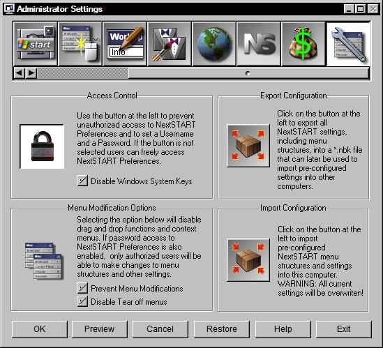
Access to NextSTART Corporate Preferences screen can be password protected. The idea is that the administrator creates all the necessary menu/hotspot structures and then prevents the end-user from performing any changes by password-protecting access to Preferences. When you enable Access Control, NextSTART Corporate will ask you for a username and a password. After that, NextSTART Corporate will always ask for the correct username and password before giving access to the Preferences screen.
When the Disable Windows System Keys option is enabled, NextSTART Corporate will prevent keyboard access to the Windows Start Menu (i.e.; pressing the WIN key or CTRL-ESC will no longer make the Windows Start Menu popup). This option will also prevent the user from restarting the system with CTRL-ALT-DEL (or making Task Manager pop up on W2k/XP systems) and from terminating applications with CTRL-F4. For this option to be effective, it is assumed that NextSTART Task Management is enabled, and that the normal Windows taskbar has been disabled (which is the default option for NextSTART, anyway). Unless the administrator specifically gives the user access to Windows Explorer on the menus, then there is no way for the user to interact with the system except through NextSTART Corporate. This gives the administrator total control over what the user can and cannot run.
To completely prevent any modifications to NextSTART menus, the Prevent Menu Modifications option should also be enabled. This will disable ALL drag and drop operations to and from the NextSTART menus and disable right click context menus. The only way to make changes to NextSTART menus is then through the Menu Editor in the Preferences screen - which is, by now, password-protected.
Once the Administrator has configured the system exactly has he wants it, he can use the Export and Import Configuration buttons to easily and quickly deploy the current configuration to other NextSTART Corporate protected systems. Exporting the current configuration will save all NextSTART settings (including menu structures, layout, hotspots, etc...) into a *.nbk file. It is then a simple matter of Importing that *.nbk file into other systems to get an exact copy the NextSTART Corporate configuration in the master machine.
The menus and other elements in NextSTART are made up by several parts, each fully customizable. Examples of these parts are the Close/Roll Up/Rotate/Always on Top titlebar buttons, menu titlebar, menu buttons/body, sub-menu indicator arrows, command key symbols, scroll arrows, startbar, start button, tasklist tiles, etc... For each of these parts you can use one of the many built-in styles or you can provide your own icons/bitmaps.
Each part may also have different states: For instance, the titlebar background can be different if the menu is active or inactive. When providing your own bitmaps, you must use the pre-defined filenames for each part/state. The bitmap used for the active menu titlebar is TitleA.Bmp/Jpg. For an inactive menu titlebar, its TitleI.Bmp/Jpg. You can find the complete bitmap filenames list in the Theme Bitmaps section below.
Once you decide which parts you want to use bitmaps for, use your favorite icon/graphics editor to make them and save them all into the same folder using the filenames described in the Theme Bitmaps table. It doesn't matter which folder it is, as long as you tell NextSTART where it can find the bitmaps by filling in the Bitmaps Folder field in the Appearence Preferences tab. When you're happy with your theme, save it using the Save Theme option in the Theme Preferences tab which will also automatically copy the bitmap files into your theme's folder.
When using bitmaps for the various items in NextSTART, these must be placed in the folder specified in the Appearance Preferences tab and have the following names:
| Wallpaper.bmp/.jpg | Theme Wallpaper. |
| TitleA.bmp/.jpg/.png | Menu Titlebar. |
| TitleI.bmp/.jpg/.png | Inactive Menu Titlebar. |
| VTitleA.bmp/.jpg/.png | Vertical Menu Titlebar. |
| VTitleI.bmp/.jpg/.png | Inactive Menu Vertical Titlebar. |
| HTitleA.bmp/.jpg/.png | Horizontal Menu Titlebar. |
| HTitleI.bmp/.jpg/.png | Inactive Menu Horizontal Titlebar. |
| ButtonA.bmp/.jpg/.png | Menu Buttons. |
| ButtonI.bmp/.jpg/.png | Inactive Menu menu buttons. |
| ButtonAS.bmp/.jpg/.png | Menu button highlighted by selection bar. |
| ButtonIS.bmp/.jpg/.png | Inactive Menu menu button highlighted by Selection bar. |
| HButtonA.bmp/.jpg/.png | Horizontal Menu Buttons. |
| HButtonI.bmp/.jpg/.png | Inactive Horizontal Menu menu buttons. |
| HButtonAS.bmp/.jpg/.png | Horizontal Menu button highlighted by selection bar. |
| HButtonIS.bmp/.jpg/.png | Inactive Horizontal Menu menu button highlighted by Selection bar. |
| SpacerA.bmp/.jpg/.png | Menu Separator. |
| SpacerI.bmp/.jpg/.png | Inactive Menu Separator. |
| ScrollA.bmp/.jpg/.png | Menu Scroll button. |
| ScrollI.bmp/.jpg/.png | Inactive Menu Scroll button. |
| HScrollA.bmp/.jpg/.png | Horizontal Menu Scroll button. |
| HScrollI.bmp/.jpg/.png | Inactive Horizontal Menu Scroll button. |
| EndcapA.bmp/.jpg/.png | Menu Endcap. |
| EndcapI.bmp/.jpg/.png | Inactive Menu Endcap. |
| VEndcapA.bmp/.jpg/.png | Vertical Menu Endcap. |
| VEndcapI.bmp/.jpg/.png | Inactive Menu Vertical Endcap. |
| HEndcapA.bmp/.jpg/.png | Horizontal Menu Endcap. |
| HEndcapI.bmp/.jpg/.png | Inactive Menu Horizontal Endcap. |
| CloseA.bmp/.jpg/.ico/.png | Menu Titlebar Close button. |
| CloseAP.bmp/.jpg/.ico/.png | Menu Titlebar Close button depressed. |
| CloseI.bmp/.jpg/.ico/.png | Inactive Menu Titlebar Close button. |
| CloseIP.bmp/.jpg/.ico/.png | Inactive Menu Titlebar Close button depressed. |
| RollupA.bmp/.jpg/.ico/.png | Menu Titlebar Rollup button. |
| RollupAP.bmp/.jpg/.ico/.png | Menu Titlebar Rollup button depressed. |
| RollupI.bmp/.jpg/.ico/.png | Inactive Menu Titlebar Rollup button. |
| RollupIP.bmp/.jpg/.ico/.png | Inactive Menu Titlebar Rollup button depressed. |
| RotateA.bmp/.jpg/.ico/.png | Menu Titlebar Rotate button. |
| RotateAP.bmp/.jpg/.ico/.png | Menu Titlebar Rotate button depressed. |
| RotateI.bmp/.jpg/.ico/.png | Inactive Menu Titlebar Rotate button. |
| RotateIP.bmp/.jpg/.ico/.png | Inactive Menu Titlebar Rotate button depressed. |
| OnTopA.bmp/.jpg/.ico/.png | Menu Titlebar Always on Top button. |
| OnTopAP.bmp/.jpg/.ico/.png | Menu Titlebar Always on Top button depressed. |
| OnTopI.bmp/.jpg/.ico/.png | Inactive Menu Titlebar Always on Top button. |
| OnTopIP.bmp/.jpg/.ico/.png | Inactive Menu Titlebar Always on Top button depressed. |
| ArrowA.ico/.png | Sub-menu indicator Arrow. |
| ArrowI.ico/.png | Inactive Menu Sub-menu indicator Arrow. |
| ArrowAS.ico/.png | Sub-menu indicator Arrow highlighted by Selection bar. |
| ArrowIS.ico/.png | Inactive Menu Sub-menu indicator Arrow highlighted by selection bar. |
| HzArrowA.ico/.png | Sub-menu indicator Arrow in horizontal menus. |
| HzArrowI.ico/.png | Inactive Menu Sub-menu indicator Arrow in horizontal menus. |
| HzArrowAS.ico/.png | Sub-menu indicator Arrow highlighted by Selection bar in horizontal menus. |
| HzArrowIS.ico/.png | Inactive Menu Sub-menu indicator Arrow highlighted by selection bar in horizontal menus. |
| UpArrowA.ico/.png | Menu Scroll up Arrow. |
| UpArrowI.ico/.png | Inactive Menu Scroll up Arrow. |
| DnArrowA.ico/.png | Menu Scroll down Arrow. |
| DnArrowI.ico/.png | Inactive Menu Scroll down Arrow. |
| LfArrowA.ico/.png | Scroll left Arrow (Horizontal Menus). |
| LfArrowI.ico/.png | Inactive Menu Scroll left Arrow (Horizontal Menus). |
| RgArrowA.ico/.png | Scroll right Arrow (Horizontal Menus). |
| RgArrowI.ico/.png | Inactive Menus Scroll right Arrow (Horizontal Menus). |
| ComSymbA.ico/.png | Menu Command Key Symbol. |
| ComSymbI.ico/.png | Inactive Menu Command key symbol. |
| ComSymbAS.ico/.png | Command Key Symbol highlighted by Selection bar. |
| ComSymbIS.ico/.png | Inactive Menu Command key symbol highlighted by Selection bar. |
| Systray.ico | Icon used for Systray button. Should be 16x16. |
| SysBack.bmp/jpg/png | Background used for the Systray in an horizontal Startbar. |
| SysBackV.bmp/jpg/png | Background used for the Systray in a vertical Startbar. |
| Tasks.bmp/jpg/png | Tasklist buttons + Systray Pop-out button. |
| TasksA.bmp/jpg/png | Foreground window task tile. |
| TasksM.bmp/jpg/png | Mouseover task tile. |
| Startbar.bmp/jpg/png | Startbar background. |
| StartbarV.bmp/jpg/png | Vertical Startbar background. |
| Start.bmp/jpg/png | Start Button. |
| StartM.bmp/jpg/png | Start Button Mouseover. |
| StartP.bmp/jpg/png | Pressed Start Button. |
| BarSep.bmp/jpg/png | Startbar section separator. |
| BarSepV.bmp/jpg/png | Vertical Startbar section separator. |
| Quick.bmp/jpg/png | Quicklaunch button background. |
| QuickM.bmp/jpg/png | Quicklaunch button on Mouseover. |
| QuickP.bmp/jpg/png | Pressed Quicklaunch button. |
| Hide.ico/png | Expanded horizontal Startbar handle. |
| HideM.ico/png | Mouseover horizontal expanded Startbar handle. |
| HideP.ico/png | Pressed horizontal expanded Startbar handle. |
| Show.ico/png | Collapsed horizontal Startbar handle. |
| ShowM.ico/png | Mouseover horizontal collapsed Startbar handle. |
| ShowP.ico/png | Pressed horizontal collapsed Startbar handle. |
| VHide.ico/png | Expanded vertical Startbar handle. |
| VHideM.ico/png | Mouseover vertical expanded Startbar handle. |
| VHideP.ico/png | Pressed vertical expanded Startbar handle. |
| VShow.ico/png | Collapsed vertical Startbar handle. |
| VShowM.ico/png | Mouseover vertical collapsed Startbar handle. |
| VShowP.ico/png | Pressed vertical collapsed Startbar handle. |
| Hotspot.bmp/jpg/png | Hotspot button background. |
| HotspotM.bmp/jpg/png | Hotspot button on Mouseover. |
| HotspotP.bmp/jpg/png | Pressed Hotspot button. |
When the theme is saved, these files PLUS any sound files that are part of the theme are automatically copied to a subdirectory in the themes folder, and the Bitmaps path in the bitmaps tab is updated to reflect this.
When a theme is loaded or imported from a ZIP file, NextSTART automatically updates the bitmap and sound paths so they point to the right place in that user's WinSTEP directory structure.
The arrow and command key symbol icons must be 16x16 icons and the symbols should be centered in the icons. If NextSTART cannot find a specified icon file, it will use the default symbol instead.
When using bitmaps for the titlebar buttons, all bitmaps should have the same width, otherwise some buttons might overlap or look too far apart.
Titlebar buttons are vertically centered in relation to the titlebar, i.e.; if your titlebar is 20 pixels high and your buttons 16 pixels, there will be a 2 pixel gap between the edges of the button and the edges of the titlebar. This does not occur horizontally, though, so when several buttons are used, they will be placed one after the other. If you want the same two pixel gap horizontally between buttons, then leave a two pixel horizontal gap on each side of the button when designing its bitmap.
If you want a button to adjust to whatever background is used on the titlebar, then use icons instead of bmp files. The titlebar background will be seen through the transparent parts of the icons.
If NextSTART cannot find a specified bitmap menu titlebar button, it will use the equivalent Newstyle button instead.
There are many theme designers constantly making new themes for NextSTART. Users who do not wish to do so, can either use one of the many themes that come by default with NextSTART or they can download hundreds of new themes from the sites referred in Here.
Its perfectly possible to have different themes associated to different menus. This allows effects similar to the one used in the Windows Start Menu, where the main menu has a sideways title bar and uses large icons - while the sub-menus have no title bar and use small icons.
To accomplish effects similar to this, you must understand that there is one thing called the current 'default' theme ( which is loaded through the Preferences screen ) and sub-themes that can be 'hard coded' to specific menus or hotspots. The concept is simple: Any menus that have no specific theme 'hard coded' to them will display the current default theme. For instance, to emulate the Windows Start Menu this is what you need to do:
1 - Create a theme with a sideways titlebar and 32 pixel icons that looks like the Start Menu. Save it as 'Main Menu'.
2 - Create a theme that looks like the Start Menu's sub-menus ( no title bar and 16 pixel icons ) and save it as 'Sub Menus'. This will be your current default theme, and for now all menus will look like that.
3 - In the Menu Editor tab, select your main menu ( should be 'NextSTART' if you haven't changed its name ) and click on the menu Properties button at the top left corner. In the dialog box that shows up, select 'Main Menu' from the list of themes shown in the 'Themes to load with Menu' section. Make sure that 'sub-menus inherit themes' is NOT selected.
And that's it. What will this do? Well, you hard coded the 'Main Menu' theme to the first menu that shows up when you click on the default hotspot. However, since you did not select 'sub-menus inherit theme', all its sub-menus will use the current default theme ( the 'Sub Menus' theme ). You can use variations of this method to accomplish different effects.
Sub-themes can be 'hard coded' to menus created in the Menu Editor ( as we did above ) or to any hotspot that displays a menu. In the later case you can 'hard code' a theme to a specific hotspot by clicking on the Properties button found in the 'Hotspot Action' section of the Hotspots tab.
Note that when loading a theme through the Preferences screen, NextSTART will prompt you if you wish to discard 'hard coded' themes first ( but only if any exist ). This was done on purpose to avoid situations where the user would load a theme and nothing would apparently happen because the menus had specific themes hard coded into them.
Menu Titlebar Skinning Preferences
The Titlebar Skinning Preferences window allows you to configure how the titlebars of your menus will look.
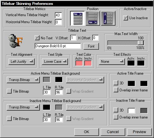
The Vertical Menu Titlebar Height defines the size, in pixels, of the titlebar of your vertical menus. This number must not be greater than 99. If it is set to 0 then the menu will have no titlebar, just like the menus in Windows. Horizontal Menu Titlebar Height, on the other hand, is the vertical height of the titlebar for horizontal menus - 0 in this case means that horizontal menus will have the same titlebar height of vertical menus. This setting enables you to have different titlebar bitmaps for menus in horizontal and vertical mode, each with its own height.
Position is fairly self explanatory, you may wish to have your titlebar in a position other than at the top of your menu. When using lateral titlebars you should be aware that on menus with only one or two items not all titlebar buttons ( close/rotate/etc... ) might be displayed due to lack of space.
If you select Use inactive, NextSTART will use different backgrounds / text colors for the titlebar depending on whether the menu is the active one or not. If this option is disabled, the sections referencing inactive attributes will be ignored.
Selecting No Text is useful if you just want to display the actual titlebar bitmap without any text. Titlebar text position can be fine tuned vertically with Vertical Offset and Horizontal Offset. How much space within the titlebar is used by the text can be defined using the Maximum Text Width slider - this is useful if you want to limit the text to a specific area within the titlebar bitmap.
In Font you can specify the font used to display the titlebar text as well as its color and size in points. Remember that pixels and points are not the same: There are 20 points in 15 pixels. Clicking on the Font button will invoke the internal Font Browser.
Text Alignment allows you to specify how the text in the titlebar shows up, either centered or justified to the left or right. Text Style allows definition of Case.
Text Color allows you to specify the color of the titlebar text on active and inactive menus. You can also use Outline or Shadow effects for the text in the Text Effects section, as well as specify the color of the outline/shadow effect for active and inactive menus.
Titlebar Background is where you define the background of your titlebar. If Gradient is selected then you can have a gradient background that starts with the first color and finishes with the second. To use other colors just click on the color buttons and choose a new color from the color palette. You also have a choice of Horizontal, Vertical or Diagonal Gradients, which may be 'wrapped' on your titlebar. You may also choose a Solid color, or a Bitmap of your choosing. If you choose bitmap, you may also choose to have it tiled instead of stretched. The Transp.Bitmap option is the same as Bitmap, except in this case NextSTART scans the titlebar bitmap for areas with the magenta color - RGB (255,0,255) - and renders these areas transparent. Do not choose this option unless you intend to use bitmap transparency, as the drawing of menus becomes more processor intensive.
Left Tile and Right Tile are very important settings if you are using bitmaps for your menu. These settings allow you to specify areas on the bitmap that will NOT be stretched horizontally when the bitmap is expanded to accommodate menu text. Up until version 2.70, menus with complex bitmaps had to be fixed width (i.e.; minimum and maximum menu widths were the same), otherwise the bitmaps would become distorted as NextSTART automatically stretched them to make room for the button text, etc... By defining a left and a right section (or tiles), only the center section of the bitmap is stretched as needed.
Title Frame is where you define if the titlebar has a ‘Flat’ or ‘3D’ look. If 3D is selected then you can also define the colors used to obtain this effect. If Overlap inner frame is selected, the titlebar 3D frame overlaps the borderline that surrounds the menu. This option is enabled by default.
Titlebar Buttons Skinning Preferences
This window allows you to define and what kind of titlebar buttons you wish to have in your menus and their position relative to each other.
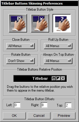
Titlebar Button Style allows choice of styles. From left to right these are classic NeXT style buttons, New Style buttons, or bitmap/icon buttons.
In Close/Rollup/Rotate/Always on top buttons, you may choose to have these buttons showing on parent menus, all menus or not at all. A Parent menu is the first menu in a sequence of menus. Also, remember that when you drag a sub-menu away from its parent menu ( by clicking and dragging on its titlebar ), it becomes a Parent menu itself - and will remain on screen until you deliberately close it.
Titlebar Buttons Relative Position allows you to choose the location of the buttons in your titlebar. Just drag the buttons to the position you want.
The Titlebar Button Offsets section allows you to specify offsets from the edges of the menu titlebar for the titlebar buttons.
Menu Button Skinning Preferences
The Menu Button Skinning Preferences window allows you to configure how each button (item) in your menu will look.
The Height box defines the vertical size, in pixels, of each of the buttons in your menu. This number must not be greater than 99.
In the Max.width box you can specify a maximum button width (in pixels). This prevents items with very long names from creating extremely wide menus. NextSTART will, however, always enforce a minimum width for each menu. In the Min.width box you can specify the minimum button width (in pixels). If the maximum and minimum values are the same, all menus will have the same width. This can be useful when using fixed size bitmaps for the buttons, but should be avoided now that bitmaps can be divided into 3 areas using Left Tile and Right Tile, where only the center bitmap section is stretched (see below).
If you select Use Inactive, NextSTART will use different backgrounds/text colors for the menu body depending on whether the menu is the active one or not.
Text Alignment allows you to specify how the text in the button shows up, either centered or justified to the left or right. With the later two options you can also define the Horizontal Offset or menu ‘margin’, i.e.; how many pixels should exist between the menu’s border and the start of the button’s text. You can also fine tune the vertical position of the button text with Vertical Offset. Under Text Style you can also specify the text Case.
In Font you can specify the font used to display each menu item as well as its color and size in points. Remember that pixels and points are not the same: There are 20 points in 15 pixels. Clicking on the Font button will invoke the internal Font Browser.
Text Color allows you to specify the color of the button text on active and inactive menus. You can also use Outline or Shadow effects for the text in the Text Effects section, as well as specify the color of the outline/shadow effect for active and inactive menus.
At Icons you can specify menu icon sizes from small icons (16x16) to large icons (32x32), or no icons at all for your menus. You can also fine tune the icon location, relative to their normal position in the menu button, by using the Horizontal and Vertical offsets.
Sub-menu indicator arrows can also have their
position fine tuned in the Arrow Offsets section.
Menu Background is where you define the background colors
of your buttons. If Gradient
is selected then you can have a gradient background that starts
with the first color and finishes with the second. To use other
colors just click on the color buttons and choose a new color
from the color palette. As with the titlebar, your gradient may
also be horizontal, vertical or diagonal. You may also choose a Bitmap for these buttons which may be tiled or
wrapped to the button or to the entire menu (if To Menu
is selected). The Transp.Bitmap
option is the same as Bitmap, except in this case
NextSTART scans the button bitmap for areas with the magenta color - RGB
(255,0,255) - and renders these areas transparent. Do not choose this option
unless you intend to use bitmap transparency, as the drawing of menus
becomes more processor intensive.
Left Tile and Right Tile are very important settings if you are using bitmaps for your menu. These settings allow you to specify areas on the bitmap that will NOT be stretched horizontally when the bitmap is expanded to accommodate menu text. Up until version 2.70, menus with complex bitmaps had to be fixed width (i.e.; minimum and maximum menu widths were the same), otherwise the bitmaps would become distorted as NextSTART automatically stretched them to make room for the button text, etc... By defining a left and a right section (or tiles), only the center section of the bitmap is now stretched as needed. If the menu button bitmap is to be applied to the whole menu, then you can also specify Top and Bottom Tiles, i.e.; areas on the bitmap that will not be stretched vertically when the bitmap is expanded to fit the menu button area.
Button Frame is where you define if the menu has a ‘Flat’ (Line) or ‘3D’ (Button) look. Buttons with no frame (None) are useful if you have selected a single bitmap to cover the entire background of the menu body (by checking the To Menu option above) or if the button bitmap itself already provides the button frame. If a framed look is selected then you can also define the colors used to draw the button frame.
The Symbol Skinning Preferences window allows you to configure whether to display command key symbols or not and define the style of the command keys symbols and the sub-menu arrows.
Some menu items may have a command key equivalent for their function. This command key will usually appear as a small letter at the right of the menu. Press this letter on the keyboard together with CTRL and that item will be executed. Note, however, that items leading to sub menus have no command key equivalent. With the Command Keys option you can select one of several styles for the command key, or disable this function altogether.
Command Key Symbol Style allows a choice of 3D, Mac-like or bitmap/icon style for a command key symbol.
Menu Arrow Style allows you to specify what kind of arrows are displayed when a menu item leads to a sub-menu. If 3D is selected then the arrows will have a 3D look, otherwise they will have a flat look much like the arrows in normal Windows menus. These flat arrows will automatically be displayed in black for a light button background and white for a dark background. The last choice of the three is for a bitmap or icon of your choice to represent the arrow.
Selection Bar Skinning Preferences
The Selection Bar window allows you to decide if a menu item should be highlighted or not when selected.
If you want the selection bar to automatically follow the mouse pointer as you move it over the menu then you should also select Follow Pointer. Selecting Blink on Click will make the selection bar 'flash' when you click on a menu item. Use Inactive will allow you to specify a different selection bar look for inactive menus.
You can specify the colors of the selection bar and highlighted text as well as if a gradient should be used or not. There is also an option to use a bitmap for the selection bar, and this may be tiled, as with the menu and titlebar buttons. Left Tile and Right Tile are very important settings if you are using bitmaps for your menu. These settings allow you to specify areas on the bitmap that will NOT be stretched horizontally when the bitmap is expanded to accommodate menu text. Up until version 2.70, menus with complex bitmaps had to be fixed width (i.e.; minimum and maximum menu widths were the same), otherwise the bitmaps would become distorted as NextSTART automatically stretched them to make room for the button text, etc... By defining a left and a right section (or tiles), only the center section of the bitmap is stretched as needed.
The Overlap Background option becomes important when you are using PNG files to skin menus in order to provide per-pixel alpha transparency. If this option is disabled, then NextSTART will automatically clear the space occupied by the Selection Bar before applying the Selection Bar bitmap - this is important because, if it doesn't do so, the alpha values of the background will be combined with the alpha values of the selection bar bitmap, rather than being replaced by. As a result, the overall transparency of the selection bar area will be LESS than the transparency of the rest of the menu, creating a 'banding' effect. However, clearing the background of the menu before applying the selection bar bitmap is not always desirable, e.g.; if the menu background has a bitmap applied to the whole menu, then the texture of the selection bar background can become mismatched - in this case you should enable 'Overlap Background' and only use totally solid areas or totally transparent areas in the selection bar bitmap.
Note that if you don't use a menu selection bar then the user won't be able to navigate the menu using the keyboard.
Menu Items Separator Skinning Preferences
The Separator Skinning Preferences window allows you to configure how menu item separators should look.
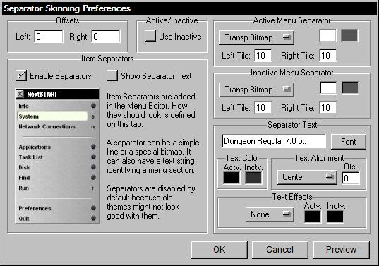
Separators (sometimes also called 'Spacers') can be used to split menus into distinct sections. A separator is inserted into a menu by going into the Menu Editor and inserting special items called 'Item Separators' into one or more key points of a menu. You can also type an 'header' identifying the menu section, which will be printed on top of the separator. Since not all themes look good with separators - and pre version 2.1 themes don't even support them - when making a theme that does support separators you should make sure that Enable Separators is checked. If your theme also supports separator 'headers', then you should check Show Separator Text as well.
Separators are not supported on horizontal menus, only on vertical menus. The vertical size of a separator item is always the same as that of a menu button.
There are basically three types of separators: Blanks, Flat/3D lines and bitmap separators. Blanks simply show an empty menu button. Lines split the separator button in 'two'. A separator bitmap, on the other hand, covers the whole separator button, and can be a transparent bitmap as well. If you are using a line as a separator, you can also specify its left and right pixel offsets from the edges of the menu (so the separator does not actually touch the menu edges) in the Offsets section.
Left Tile and Right Tile are very important settings if you are using bitmaps for your separators. These settings allow you to specify areas on the bitmap that will NOT be stretched horizontally when the bitmap is expanded to accommodate menu text. Up until version 2.70, menus with complex bitmaps had to be fixed width (i.e.; minimum and maximum menu widths were the same), otherwise the bitmaps would become distorted as NextSTART automatically stretched them to make room for the button text, etc... By defining a left and a right section (or tiles), only the center section of the bitmap is stretched as needed.
If your theme supports separator 'headers', you can also specify the Font used for the headers, its color, effect, justification and offset - in pixels - from the edge of the menu.
Menu Endcap Skinning Preferences
The Endcap Skinning Preferences window allows you to configure how the endcap in a menu should look.
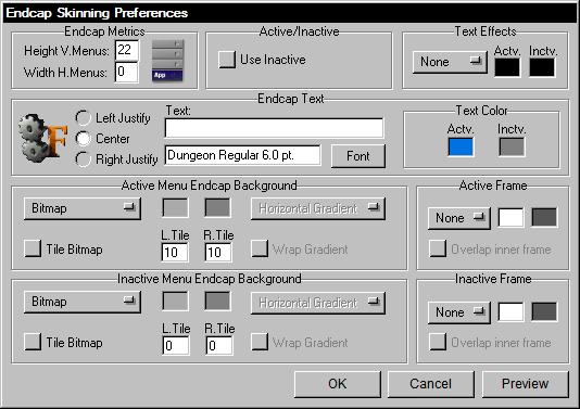
In Endcap Metrics you can define the size in pixels of a menu's endcap for both vertical and horizontal menus. A size of 0 means the menu does not display an endcap.
If you select Use inactive, NextSTART will use different backgrounds/text colors for the menu endcap depending on whether the menu is the active one or not.
NextSTART can also display a fixed caption (like the name of the theme) in menu endcaps. In Endcap Text you can specify this string as well as the font used to display it, its color, effects and size in points. Remember that pixels and points are not the same: There are 20 points in 15 pixels. Clicking on the Font button will invoke the internal Font Browser.
Endcap background is where you define the background of the endcap. If Blend with Menu is selected, NextSTART will extend the menu body background onto the endcap. If Gradient is selected then you can have a gradient background that starts with the first color and finishes with the second. To use other colors just click on the color buttons and choose a new color from the color palette. As with the titlebar, your gradient may also be horizontal, vertical or diagonal. You may also choose a bitmap for these buttons which may be tiled or wrapped to the endcap. The Transp.Bitmap option is the same as Bitmap, except in this case NextSTART scans the button bitmap for areas with the magenta color - RGB (255,0,255) - and renders these areas transparent. Do not choose this option unless you intend to use bitmap transparency, as the drawing of menus then becomes processor intensive.
Left Tile and Right Tile are very important settings if you are using bitmaps for your menu. These settings allow you to specify areas on the bitmap that will NOT be stretched horizontally when the bitmap is expanded to accommodate menu text. Up until version 2.70, menus with complex bitmaps had to be fixed width (i.e.; minimum and maximum menu widths were the same), otherwise the bitmaps would become distorted as NextSTART automatically stretched them to make room for the button text, etc... By defining a left and a right section (or tiles), only the center section of the bitmap is now stretched as needed.
The Frame section is where you define if the endcap has no frame, or a ‘Flat’ or ‘3D’ look, and the type of the 3D look. If 3D is selected then you can also define the colors used to obtain this effect.
The Menu Skinning Preferences window allows you to configure specific settings for the whole menu.
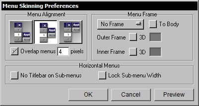
The Menu Alignment section defines where you wish the sub-menus to appear in relation to their parent menu. If you select Overlap Menus then sub-menus will be slightly offset onto their parent menus, causing an overlap effect similar to the one used in regular Windows menus. You can also specify by how much a sub-menu should be offset from its parent menu.
In Menu Frame you can select the color used to draw the borderline surrounding the menu. You may also choose to have a single or double frame, or no menu frame at all. If To Body is selected, the 3D frame of the menu surrounds only the body of the menu (i.e.; NOT the titlebar area). This enables you to achieve a 3D effect where it looks like the menu is composed of two independent pieces: the titlebar and the actual menu body.
In Horizontal Menus you can specify if vertical menus originating from an horizontal menu have a titlebar or not and if they are forced to the same width as their parent button.
The Startbar Skinning Preferences window allows you to configure how the startbar body looks.
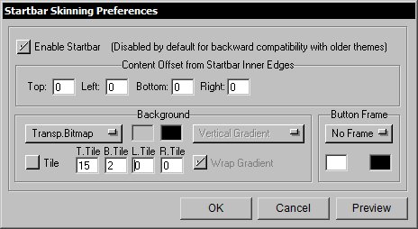
If your theme supports a startbar, then you should check the Enable Startbar option. NextSTART versions prior to 3.0 did not support a startbar, that is why this option is disabled by default.
The Content Offset from Startbar Inner Edges section allows you to specify the size of the empty area between the startbar inner edges and the objects it contains.
Background is where you define the background of the starbar. If Gradient is selected then you can have a gradient background that starts with the first color and finishes with the second. To use other colors just click on the color buttons and choose a new color from the color palette. As with the titlebar of menus, your gradient may also be horizontal, vertical or diagonal. You may also choose a Bitmap for the startbar background, which may be tiled or stretched as needed. The Transp.Bitmap option is the same as Bitmap, except in this case NextSTART scans the startbar bitmap for areas with the magenta color - RGB (255,0,255) - and renders these areas transparent. Do not choose this option unless you intend to use bitmap transparency, as the drawing of the startbar then becomes more processor intensive.
Top Tile, Bottom Tile, Left Tile and Right Tile are very important settings if you are using bitmaps for your startbar. These settings allow you to specify areas on the bitmap that will NOT be stretched horizontally when the bitmap is expanded to accommodate all the objects it contains. By defining a top, bottom, left and a right section (or tiles), only the center section of the bitmap is now stretched as needed.
The Frame section is where you define if the startbar has no frame, a ‘Flat’ or ‘3D’ look, and the colors of the frame. If Single or 3D are selected, then you can also define the colors used for the frame.
Start Button Skinning Preferences
The look of the Start button can be specified in this preferences panel.
The Start Button Caption section allows you to specify the font, position and text effect used for the text that is to appear in the Start Button, as well as the caption itself. If you do not desire any caption, or if the caption is already part of the Start Button bitmap, then you should leave Show Caption un-checked.
The Start Button can have three possible looks: Normal, Mouse Over (when the mouse pointer is over the button) and Depressed (when the user clicks on the button). When the mouse over settings or the depressed settings are not specified (Use MouseOver and/or Use Depressed are un-checked), NextSTART will automatically use the Normal settings. For each of these states you can specify a button frame, button frame colors, text and text effect colors (the later only relevant if Show Caption is enabled) plus the button background (solid, gradient, bitmap or transparent bitmap). In the Normal section you can also specify the size of the Start Button in pixels.
Section Separator Skinning Preferences
The Separator skinning Preferences window allows you to configure how the startbar section separators look.
Section separators are the optional lines/bitmaps used to divide each startbar section (Start Button, Quick Launch Area, etc...). The Offsets section allows you to define the end and starting points, relative to the edges of the startbar body, of the separator - note that section separators offsets are independent of the offsets specified for the contents of the startbar.
The separator itself can be blank (i.e.; none), a single or double line, or a bitmap, transparent or not. If you specify a bitmap, then you can also specify the non-stretchable sections in T.Tile and B.Tile, as well as if the bitmap is to be stretched to fit or tiled.
Quick Launch Button Skinning Preferences
The Quick Launch Button Skinning Preferences panel allows you to configure the look of each button in the Quick Launch area of the Starbar.
Just like the Start Button itself, Quick Launch buttons can have three states: Normal, MouseOver and Depressed. If Show Icons Only is selected then Quick Launch buttons have no background and only display the icon itself. In Gap between buttons you can specify the gap between each button in pixels. You can also specify a vertical and horizontal offset, between -8 and 8 pixels, from where the Quick Launch icons would usually appear.
The background of Quick Launch buttons can be either a solid color, a gradient, a bitmap or a transparent bitmap. If you use a bitmap background you can also specify if the bitmap is to be tiled as well as any non-stretchable parts in T.Tile, B.Tile, L.Tile and R.Tile. There is no fixed Quick button size because it depends on the Quick Launch icon size, which is a user-selectable option. Quick Launch buttons can also have a frame, in which case the colors of the frame can also be selected.
The Tasklist Skinning Preferences window allows you to configure the look of your NextSTART tasklist.
If Show Caption on Tasks is disabled, only the task's icon is displayed on the tasklist button, otherwise the task name is also displayed next to the icon. Note that a tooltip with the full name of a task is always displayed when you move your mouse pointer over a tasklist button (unless the Show Tasklist Tooltips option in the Tasklist and Systray Preferences tab has been disabled by the user). On themes that do not display captions on tasklist buttons, this tooltip shows up immediately so the task can be quickly identified, otherwise the tooltip is only displayed after a small delay. If you choose to display task captions, then you can also choose their font and text effect. Caption colors can be individually selected below for each of the three possible tasklist button states (normal, mouseover and foreground).
Tasklist Style determines whether the tasklist is made of buttons or simply of icons. If icon style is chosen, then the tasks have no background whatsoever and they do not display a caption, regardless of the Show Caption on Tasks setting. It is, however, possible to have a transparent background tasklist in which only the icons and the task captions are visible: enable Show Caption on Tasks and select a button-style tasklist with Transparent as the background setting.
In the Button Metrics section you can specify the size (in pixels) of the tasklist buttons. If a size of 0 is selected then NextSTART will automatically calculate the optimal size for the tasklist button in order to fit the task's icon (usually 16 pixels higher/wider than the icon size specified by the user). If a size other than 0 is used, NextSTART will respect the specified size as long as the task's icon fits, but it will proportionally enlarge the button as necessary otherwise (remember users can specify three icon sizes for the tasklist - 16x16, 32x32 and 48x48 - and that the skinner has no control over this).
In the Button Gaps section you can specify a vertical and horizontal gap (in pixels) between task buttons.
In the Icon Offsets section you can fine tune the position of a task's icon within the button itself. Specifying an horizontal icon offset will also affect where the task's caption is displayed (always just after the icon), as well as how much space is available to it (note that when the full task description does not fit, the text is automatically cropped at the end). The vertical icon offset has no effect on the position of the task's caption.
In the Text Offsets section you can fine tune the position of a task's caption within the button itself.
Task buttons can have three states: normal, mouseover - when the mouse pointer is over the task button - and foreground - when the task's window is the active (foreground) one. For each of these states you can specify individual button backgrounds, caption colors and button frames.
Background is where you define the background colors of the task button. If Gradient is selected then you can have a gradient background that starts with the first color and finishes with the second. To use other colors just click on the color buttons and choose a new color from the color palette. As with the titlebar, your gradient may also be horizontal, vertical or diagonal. If you select Transparent, the button has a transparent background and only the icon, button frame and caption are visible. You may also choose a Bitmap for these buttons which may be tiled or wrapped to the button. The Transp.Bitmap option is the same as Bitmap, except in this case NextSTART scans the button bitmap for areas with the magenta color - RGB (255,0,255) - and renders these areas transparent. Do not choose this option unless you intend to use bitmap transparency, as the drawing of menus becomes more processor intensive.
Left Tile and Right Tile are very important settings if you are using bitmaps for your menu. These settings allow you to specify areas on the bitmap that will NOT be stretched horizontally when the bitmap is expanded to accommodate menu text. Up until version 2.70, menus with complex bitmaps had to be fixed width (i.e.; minimum and maximum menu widths were the same), otherwise the bitmaps would become distorted as NextSTART automatically stretched them to make room for the button text, etc... By defining a left and a right section (or tiles), only the center section of the bitmap is now stretched as needed.
If you choose button style for your task list, you may also choose to have a frame, or not, and the colors for this frame may be defined in Tasklist Button Frame. You may also choose to have a static or push-in style of button.
Hotspot Button Skinning Preferences
The Hotspot Buttons Skinning Preferences panel allows you to configure the look of Hotspot Buttons.
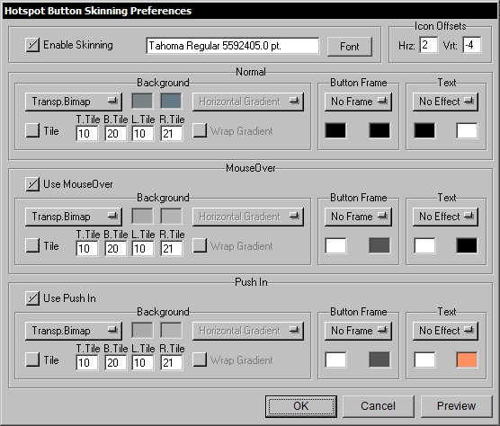
Hotspot buttons can have three states: Normal, MouseOver and Pushed In. Until version 4.0, Hotspot buttons used the tasklist bitmaps and could not be skinned individually. With version 4.0 this changed, but, to maintain backwards compatibility, you must specifically state you are providing Hotspot Button theme settings by selecting the Enable Skinning option.
Hotspot buttons can have a caption if the user wants them to, so you should also specify font settings, effects and colors. Hotspot button captions are always displayed after the icon.
The Icon Offsets section allows you to position the hotspot button icon relative to the bitmap. Remember that the size of the icon is always selected by the user, and can range from 16x16 to 48x48. The icon position itself depends on the offsets you specify here as well as on the left and right tile areas of the Hotspot Button bitmaps. If the bitmap doesn't have a left tile (L.Tile) section, the icon will be positioned at pixel 8 plus the horizontal icon offset you specify here. If the bitmap has a left tile section, NextSTART assumes you don't want the icon to overlap this section and moves it further right by the amount of pixels specified for the left tile section. You can override this by specifying a negative horizontal icon offset.
The background of Hotspot buttons can be either a solid color, a gradient, a bitmap or a transparent bitmap. If you use a bitmap background you can also specify if the bitmap is to be tiled, and, if not, the non-stretchable parts in T.Tile, B.Tile, L.Tile and R.Tile - this is because the size of Hotspot buttons is not fixed and depends on a number of factors defined by the user, i.e.; icon size and even hotspot button size. Hotspot buttons can also have a frame, in which case the style and colors of the frame can also be selected.
To uninstall NextSTART use the Add/Remove Programs applet in the Windows Control Panel.
Non TrueType fonts should not be used on menus with vertical title bars. This is because only TrueType fonts can be rotated. If you specify a non-TrueType font, Arial will be used instead.
Some systems seem to have trouble with the 'Shutdown Windows' internal command. If your system is one of those, try tweaking the 'Force Power Off' and 'Force Shutdown' options in the Global Preferences tab. If that still doesn't help, the Microsoft Knowledge Base has several articles about this that might help you troubleshoot your system. For instance, try Q238096 - How to Troubleshoot Windows 98 Second Edition Shutdown Problems
When you have your taskbar hidden, either by using NextSTART's task management or the 'Hide Taskbar' internal command, windows might still not maximize to the bottom of the screen. To accomplish this, make sure your Windows taskbar is set to auto-hide and NOT set to 'always on top'. Newer versions of Windows, however, will automatically render the taskbar visible again if auto-hide is on when a program is launched. To solve this problem you will have to disable the auto-hide feature of the Windows taskbar - which will again prevent your programs from maximizing to the bottom of the screen. Your only solution then is to manually resize the Windows taskbar so that only a thin line at the edge of the screen is visible.
If hotspots keep firing in the wrong windows, go to the Hotspots tab and make sure that Exact Match is selected for the troublesome hotspots.
Left click popups of some of the system systray icons in Vista and Win7 might show up at the wrong location when NextSTART is being used to replace the Windows taskbar. The same is true for spontaneous balloon notifications, and happens because Microsoft developers never programmed Windows taking into consideration third party shell enhancers or replacements.
FAQ (Frequently Asked Questions)
Q) Will
NextSTART
slow down my system?
A) NextSTART
is very light on resources, so any performance hit is negligible.
You can run NextSTART
without any problems on Pentium II machines at 150 MHz or
even less.
Q) Is NextSTART compatible with
Windows 95/98/ME and NT4 or does it work only on Windows 2000 and above?
A) NextSTART will run on all Windows versions, but some of the more
advanced features, like per pixel alpha transparency, will not be available
unless you are using Windows 2000 and above. Note that NextSTART gives theme
authors a fall back mechanism that will make themes using per pixel alpha
transparency display properly on Win9x/NT4 systems (without the per pixel alpha
effects), but theme authors must explicitly
take advantage of it.
Q) Is NextSTART compatible with Windows XP 64
bit, Windows Vista 32/64 bit and Win7 32/64 bit?
A) Yes.
Q) When running NextSTART some applications don't display properly or create screen artifacts
(XP only).
A) NextSTART uses a new function in XP to display tasks as snapshots of the
actual windows. This function is still somewhat buggy and some applications may
not behave properly with it, resulting in the artifacts you see or in the
application not displaying properly at all. With the problem application
running, CTRL-Right Click on the
application's task icon. In the context menu that pops up, select 'Add to
Snapshot Exclusion List'.
Q) WinDVD 7 and
Roxyo Player 2.0 do not display video when NextSTART is running. Is there
any way to fix this?
A) Yes, but be aware that this is a problem with the players themselves, not
with NextSTART. You will have the same problem if you run any application
that uses layered windows to obtain per pixel alpha transparency. Windows Media
Player, PowerDVD and Ulead Player (and certainly most others) do not have this problem, for instance. To fix the
problem in WinDVD and Roxyo, you must disable the video overlay mode in
Advanced Options and restart the application.
Q) NextSTART
crashes when I open the Control Panel menu!
A) This means one of your Control Panel applets is corrupt.
Q) How
do I make NextSTART run automatically every time I reboot my computer?
A) Open the Global Preferences tab and enable 'Run NextSTART on Startup'.
Q) Can
I run NextSTART as the shell?
A) NextSTART is a regular application that enhances the shell, not a shell replacement. You can run
it as the shell, but this is not supported and you will lose your Systray,
among other Explorer provided functions. Nothing stops you, however, from running
NextSTART along with other shells - such as LiteStep
or GeoShell.
Q) How do I install
and preview downloaded themes?
A) If the file is a .xtreme file, simply double click on it, if an older .zip
file, open the Themes tab in preferences. If you have downloaded the theme
zip files to the \Winstep\AutoInstall folder, all you have to do is click on
the Import button (the one with the box icon) and NextSTART will automatically
install all of them. If not, you will first have to provide the path to where
the theme zip files were downloaded. Once the themes have been installed, they
will be available from the Load Theme combo box. Select the theme you want to
preview and click on the Diskette button or click on the Preview button below. Once you are happy with the theme
you selected, press the OK button in Preferences to make it effective.
Q)
How do I prevent
NextSTART
from changing my wallpaper every time I change a
theme?
A) Open the Themes Management tab in NextSTART Preferences and click on
the Theme Options button . On the Load Theme Options dialog that pops up, make
sure your wallpaper is set to 'Locked'.
Q) I want to make my
own theme. What is the best way to start?
A) Open the Themes Manager tab of NextSTART Preferences and select an
existing theme as similar as possible to the theme you want to make. Now change
the name of the theme to whatever you want, put your name in the Author box and save
by clicking on the button with a picture of a diskette and pencil. NextSTART will automatically create a new theme folder, copy all the original bitmaps,
fonts and configuration files into it, rename the configuration files so they
match the name of your theme and add the new theme to the list of available
themes. You can view the contents of this newly created folder in Explorer by
clicking on the button with a picture of a folder, and you can now play with the
theme settings and bitmaps safe in the knowledge that you are not changing a
previously existing theme.
Q) Can I use
the WIN or CTRL-ESC keys to pop up my NextSTART menu instead of the normal
Windows Start Menu?
A) No, and this is by design. We feel that the Windows Start Menu should
always be available in case a user deletes his NextSTART menu by accident or
something bad like that... Besides, you can always use other hotkey
combinations (CTRL-? or ALT-? key combinations) to invoke the hotspot
associated to the main NextSTART menu - it's just a question of getting used
to a new keyboard shortcut. NextSTART Corporate does allow you to disable the
WIN and CTRL-ESC keys, but the intention here is to provide a secure desktop.
Q) How do I get my
normal Windows taskbar back?
A) The easiest way is to open the Settings sub-menu in your main NextSTART
menu and click on either 'Toggle NS Task Management' or 'Hide/Show Windows
Taskbar'.
Q) NextSTART
disabled Active Desktop on startup (after warning me about it) but now I want
to enable it again. How do I do this?
A) Open NextSTART Preferences, go to the Global Preferences tab and click
on the 'Enable Active Desktop' button. Alternatively open the Windows
Registry Editor, look for
'HKEY_CURRENT_USER\Software\Microsoft\Windows\CurrentVersion\Policies\Explorer\'
and set 'NoActiveDesktop' to 0.
Q) Why do my systray
tooltips and right click menus pop up behind the NextSTART system tray?
A) Temporarily turn off NextSTART task management, right click on an empty
area of the Windows taskbar and select Taskbar Properties. Set the Windows
taskbar to be 'Always On Top'. This will solve your problem, but now the
taskbar will be reserving screen space at the bottom. If you want to prevent
it from doing this, drag the edge of the Windows taskbar down so only a thin line
is visible. Re-enable NextSTART task management.
Q) How do I make
NextSTART automatically hide my desktop icons when it runs?
A) Open the Global Preferences tab and enable 'Hide Desktop
Icons on Startup'.
Q) I have enabled
the 'Hide Desktop Icons'
setting in Preferences, but the icons are still visible. How do I hide them?
A) That setting is used to make NextSTART hide desktop icons automatically
next time it runs. To hide your desktop icons now, open the
Settings sub-menu in your main NextSTART menu and click on 'Hide/Show Desktop
Icons'.
Q) I want my menu to
appear when I left click anywhere on the desktop, instead of having to use a
Start Button look-alike. How do I do this?
A) Open the Hotspot Preferences tab and change the Launch With action to
'Left Click on Hotspot'. You might also want to enable 'Snap to Mouse'.
Q) I was playing
with hotspots and I lost my Hotspot/Start button! How can I get it back?
A) Open the Hotspots Preferences tab and select 'Left Click on Hotspot
Button' as the Launch With action for hotspot 0.
Q) I
want my menu permanently on the screen until I close it manually. How can I do
this?
A) Open the Hotspot Preferences tab and instead of 'Close All Menus'
select 'Parent Menus Stay Open'.
Q) How do I make
NextSTART automatically open a menu when it runs?
A) Open the Hotspot Preferences tab, select the hotspot associated to that
menu and enable 'Auto Run'.
Q) I
want to have another menu, besides the default one, permanently on the screen.
However, when I access one menu the other closes and vice-versa. How can I
have two or more independent menus simultaneously on the screen?
A) Open the Hotspot Preferences tab and give a different Group name to the
hotspot associated with your permanent menu.
Q) How
do I make a menu open in horizontal mode instead of vertical?
A) Open the Hotspot Preferences tab and enable 'Horizontal Menu' for the
associated hotspot.
Q) I have created a
new menu using the built-in Menu Editor but I do not see it anywhere! What is
going on?
A) Most likely you have not associated your new menu to a hotspot. Open
the Hotspot Preferences tab and click on 'Add' to create a new hotspot. Once
your new hotspot has been configured you can associate your new menu to the new hotspot by
selecting its name from the Menu Name combo box. Make sure your new hotspot
does not overlap any previously existing ones (might be a good idea to select
'Bump Top Screen Edge' first as the Launch With action to make sure the new
hotspot is active and working as intended).
Q) Can
I drag items from NextSTART to WorkShelf and vice-versa?
A) Yes, just remember that to drag items from NextSTART menus you must
press either the SHIFT (move) or CTRL (copy) keys while doing so.
Q) My computer does
not Power Off or hangs when I select Shutdown Windows from the NextSTART menu?
A) Open the Global Preferences tab and enable 'Force Power Off'. If that
still doesn't work, you might also try enabling 'Force Shutdown'.
Q) Help!
I'm totally lost and I want my default NextSTART configuration back... How can
I make it as it was?
A) NextSTART makes a backup of the default configuration when it runs for
the first time. Open the Global Preferences tab and click on the Restore
button. Look for a file named NsDefault.nbk in your Winstep Backup folder.
Running NextSTART with LiteStep
NextSTART and the LiteStep shell work just fine together. There are only two minor glitches which are both easy to fix:
1) Make sure you do *not* load popup.dll in the
LoadModule section of your step.rc file. Either comment out the line or remove
it altogether. If you don't do this, and try to bind an NS menu to the right
mouse button, you'll get the LiteStep popup menu instead.
2) Assuming you install and initially configure NextSTART running Explorer as
your shell (recommended), the first time you switch shells to LiteStep and load NextSTART, your menus will probably not work. Don't panic. Activate the
NextSTART configuration panel By pressing Ctrl-F12 or from the systray icon, go
to the Hotspots Definition tab. on the left side of the panel, see the
"Apply Hotspot to" area. Chances are the textbox beside the magnifying
glass icon will say either "Desktop" or "Program Manager".
Just drag the magnifying glass icon out onto your desktop and let it go. The
text box should now say "LiteStep". Click "OK" to save your
changes and your menus should work just fine. Note that you will have to do this
for each hotspot you have defined.
If you switch between shells regularly, another great idea is to define your hotspots twice (e.g. hotspot 0 and hotspot 1 are identical in all respects save one points to "program manager" and the other to "litestep" - same with 2 and 3, etc...) That way changing shells won't affect your menus at all.
You can download the latest version of NextSTART and Winstep Xtreme from
For questions and support just e-mail us at
or visit the Winstep Message Board at
http://forums.winstep.net/phpBB2/index.php
Special thanks to:
John T.Folden for being the inspiration engine for Winstep and its main graphics designer.
Jody Holmes for his friendship, help and bandwidth provided, plus setting up and hosting the Winstep IRC server and mirror.
Paul Cobbs for all the help testing stuff and helping me with the graphics.
Sue Wotton for helping to write the 2.x User Guide and bug testing NextSTART 2.x.
Ric Sharma for his great NeXT related suggestions and insight, and for all that bug testing.
Brent Edwards for his great advice on running NextSTART with LiteStep.
Daniel Seiden, Stephane and Basiclink for their incredible work setting up the Winstep web site and Forums. If you need a host for your web site, you can't do better than Basiclink.
Thomas Bradford, Jen, Barb, Kim Valentine and all the other people at BMT Micro for always going above and beyond the call of duty.
Tim Dagger aka Essorant for the NextSTART 2.x default Recidivist theme and for all those other nice themes. You can visit his web site at http://essorant.ipfox.com
Renato C. Veras Jr. aka Treetog for all his help and incredible work. Do yourself a favor and visit his web site at http://www.treetog.com
In memory of José Carlos Baldo (1965-2001): wherever you are now, thanks for designing the NextSTART 1.0 logo and for helping with the initial graphical layout of the program.
And finally but not the least, many thanks to all the wonderful people who dwell on the Winstep mailing lists and forums. Thank you for all the great suggestions and help testing Winstep applications - we owe it all to you.